I design 0→1 products for complex experiences, from early strategy to final launch.
With 10 years of experience working on digital products, I like going where there are problems to solve. I use data, research, and AI-assisted development to help design products that make strategic impact.
For Industry Leaders and Market Challengers
M is for Many Hats
I came into the design world with an understanding that design does a little bit of everything. I also have delusional confidence and curiosity that makes me want to learn a lot of things. Because of that I consider myself a “M-shaped” designer. I go deep on Product Design, Research, and Strategy, but also have experience in Branding, and Graphic Design. This allows me to work cross-functionally at larger organizations, and flex into different roles at smaller ones.
As a strategically minded designer, I am always digging into the tradeoffs of what we're deciding to build and how it ultimately helps us reach our goal. I love testing and iterating on concepts, using data, and figuring out how to find product-market fit.Product Strategy
I'm always thinking about how product and marketing can work more closely together, as in many cases, the product is the brand! My experience in branding helps me think more deeply about the user experience and how products are perceived in the real world.Branding
I'm a generalist at heart, owning the full design process from wireframing to final QA. My UX approach blends intuition with experience, grounded in usability and accessibility, and noticing the details that others miss.Product Design
Creating marketing content and physical collateral for products has helped me sharpen my UI design skills and think of products in a new way. I love thinking about how a product communicates itself beyond the screen.Graphic Design
I love moderating interviews and conducting surveys to gather insights. It's not just about knowing what to ask, but how and when. I love digging deep into the why to come up with solutions to problems users have (and might not even know they have!) This is where the best product ideas come from.Research
Tap to read
Product Design
01
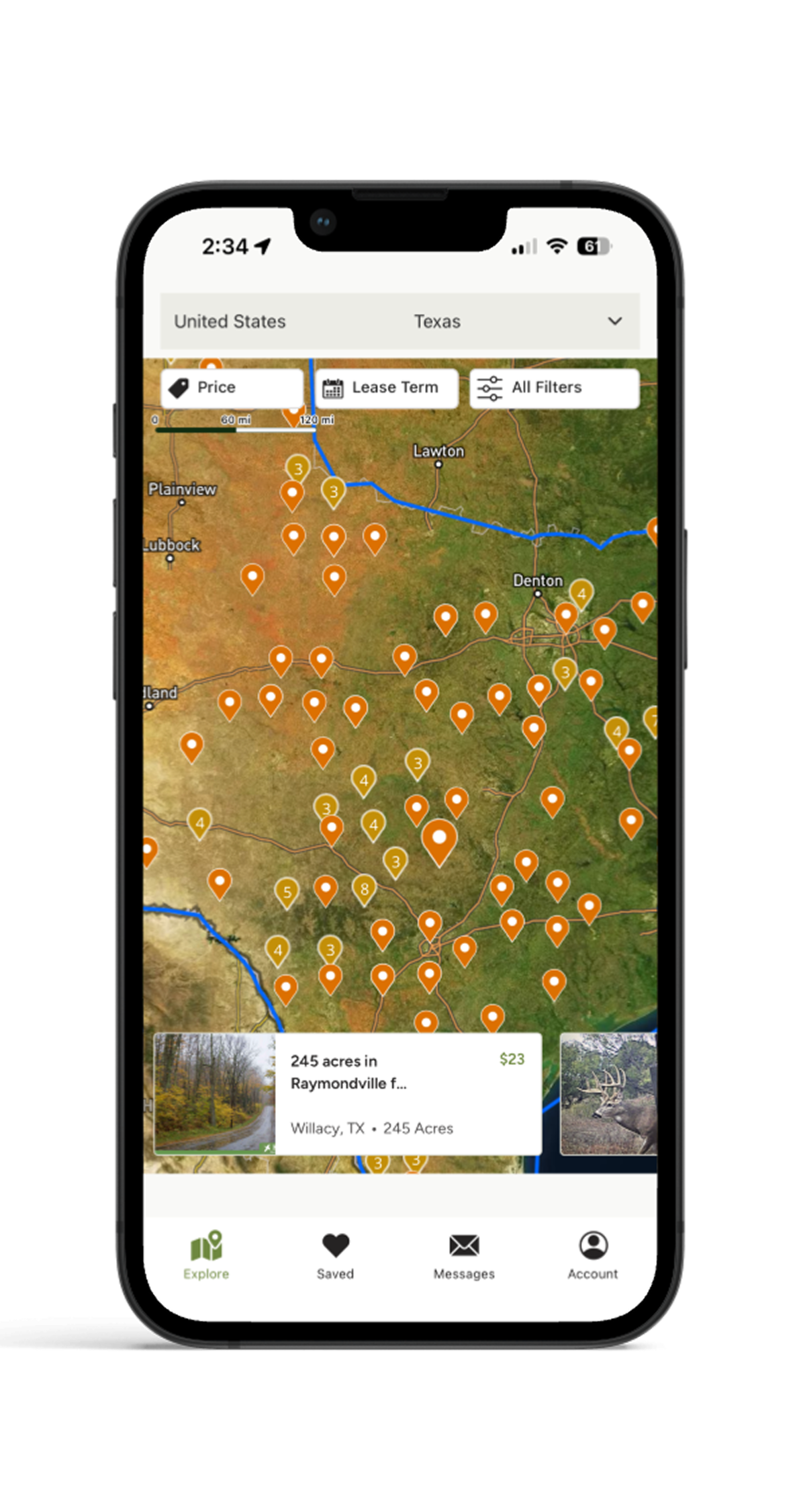
Turning Hunter Intent Into a 3x Lift in Lease Transactions
HLRBO · Product Design
Product-Market FitAI-Assisted DesignDesktop / Mobile Web
02
Turning Fragmented Outdoor Program Workflows into a Scalable Platform
Wildlife Connects / Texas Wildlife Association · Product Design
AI-Assisted DesignOperational ComplexityDesktop / Mobile Web
03
Unifying Sales Experience Across 40 Markets to Save $400,000+ in Fragmented Software Spend
Lennar · Product Design
Systems ThinkingResearch-FocusedDesktop Web
04
Increasing New Merchant Receiving Orders by 24%
ShipBob · Product Design
Research-FocusedOperational ComplexityDesktop Web
05
Reducing Complexity in the Trading Pathway for High-Volume Traders
TD Ameritrade · Product Design
Complex WorkflowsDesktop / Mobile Web
06
Designing the HLRBO Mobile App from Scratch
HLRBO · Product Design
UI Design0→1Mobile App
07
Redesigning PublicSquare’s Mobile App Shopping Experience
PublicSquare · Product Design
UI DesignMobile App
Visual Design
My Product Development Philosophy
01Start small and iterate
It's better to launch something and learn than to wait and debate and never launch anything because you want it to be perfect.
02Just because you can doesn't mean you should
AI is making building things faster and easier than ever. That means it's even more important to listen to users and understand what they actually need.
03Form follows function
Users care more if a product solves their problem than if it looks sexy. UI is the icing on the cake.
04Nobody has all the answers
And anyone that acts like they do is lying. Product development is a game of tradeoffs and the goal is to learn.
About
I’m Lena, a Chicago native who’s a Texan at heart. After college I started in product but being a natural creative, it wasn’t long before I moved into UX design. I get energy from solving complex business problems and creating simple, intuitive experiences for users.
In my free time I love hunting, cooking, and traveling (to Japan in particular).
“Lena Stefani is the kind of UX designer every team hopes to have—strategic, insightful, and relentlessly focused on improving the user experience. What sets Lena apart is her ability to translate complex research findings into elegant, intuitive design solutions that truly move the needle.”
Adrienne GuilloryPresident, Usability Sciences
“Lena has a gift for navigating complex product problems with incredible attention to detail. She doesn’t just design; she facilitates high-level collaboration across the entire organization to ensure the right solution is built. She would be a massive asset to any team.”
David Proft
“Lena is the kind of designer every product manager hopes to work with—deeply grounded in user research, obsessed with solving the right problems, and consistently able to translate insights into intuitive, high-impact design. She has an exceptional ability to balance user needs with business goals, and she always prioritized speed to value without compromising quality. Whether we were refining early prototypes or launching core product features, Lena was a driving force behind our team’s momentum and success.”
James Van Guilder
Ready to Build?
Let’s talk. Drop me a message below.
Message sent! I’ll be in touch soon.
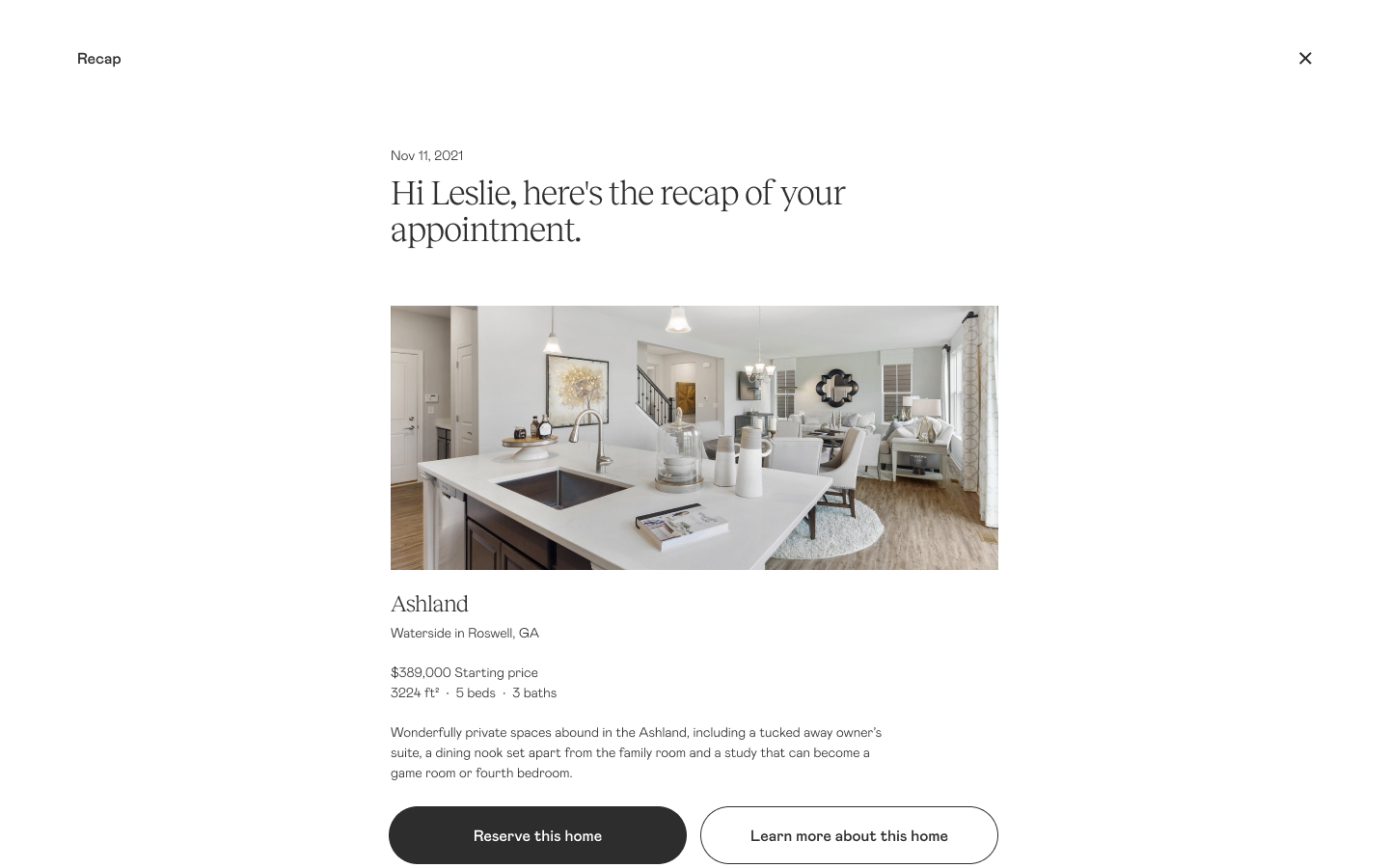
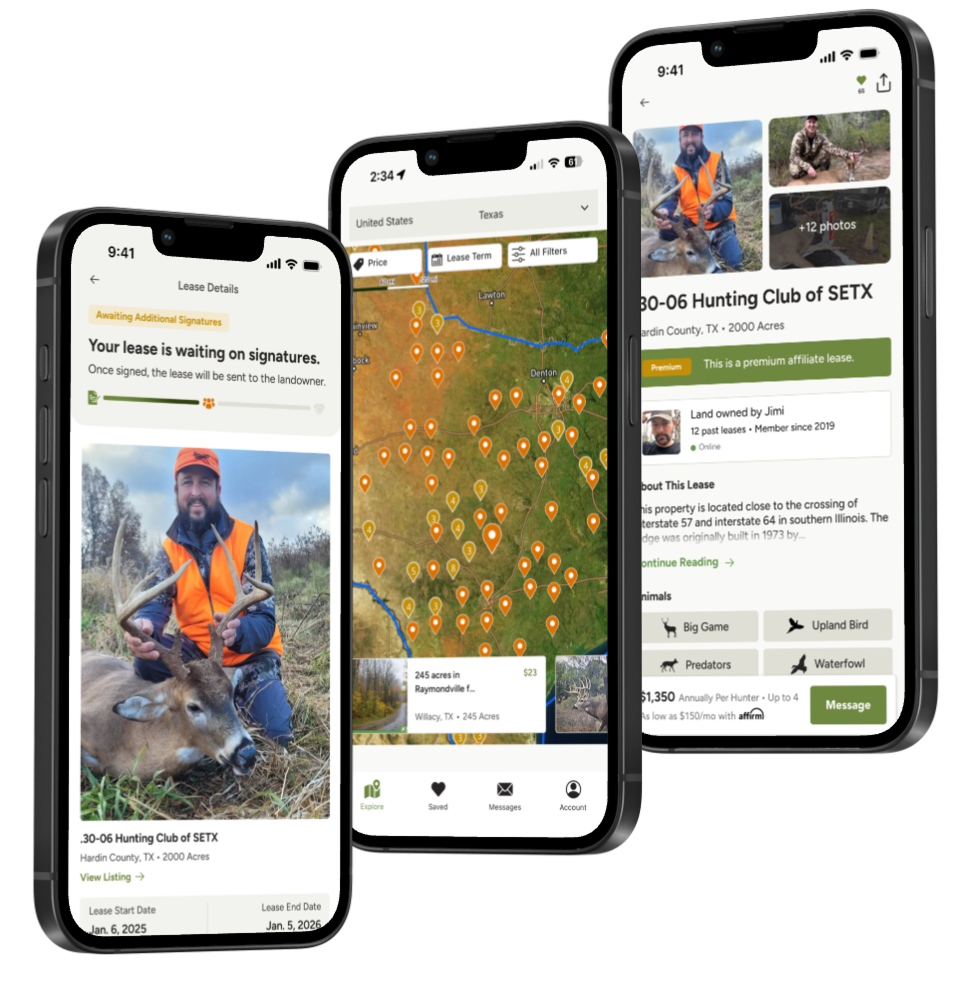
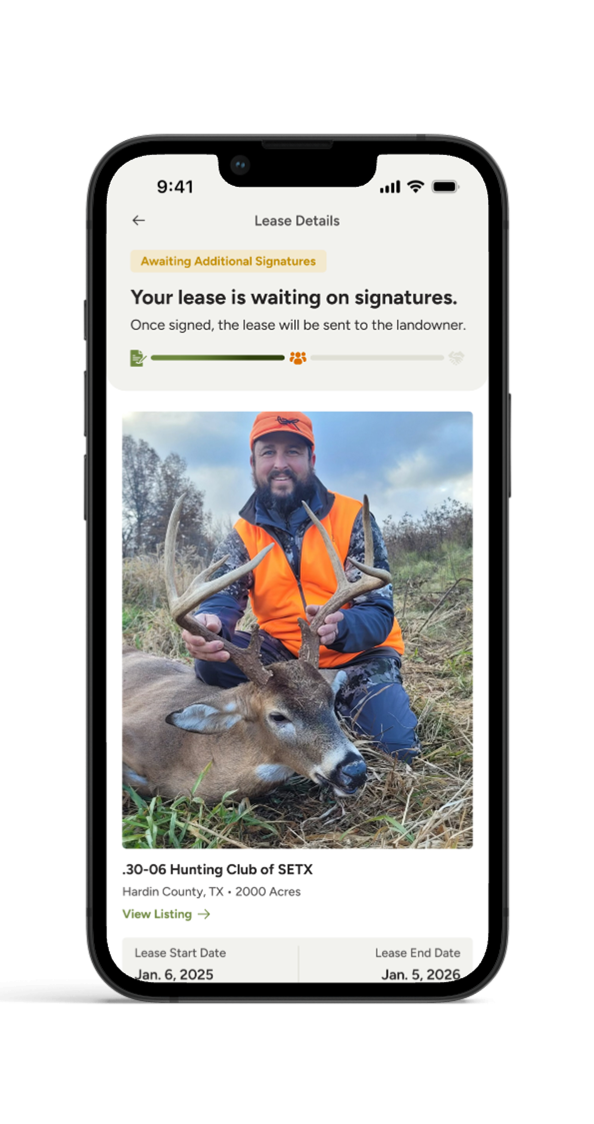
Turning Hunter Intent Into a 3x Lift in Lease Transactions
HLRBO · Product Design
CompanyHLRBO
ProductLandkey
My RoleProduct Design, UX Strategy, Workflow Design, Research Synthesis, AI-Assisted Iteration
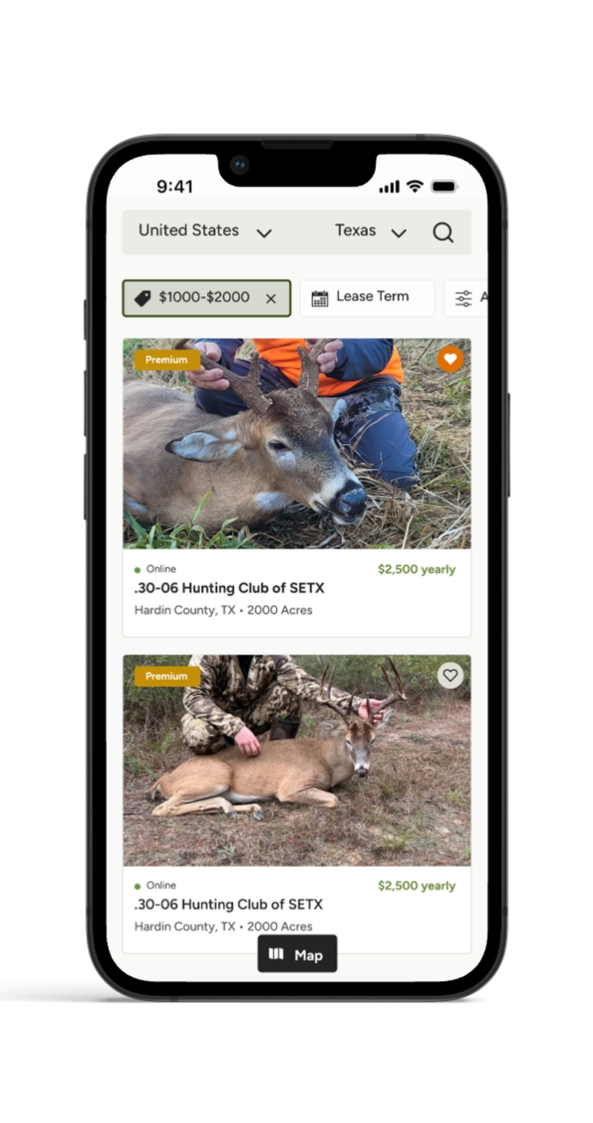
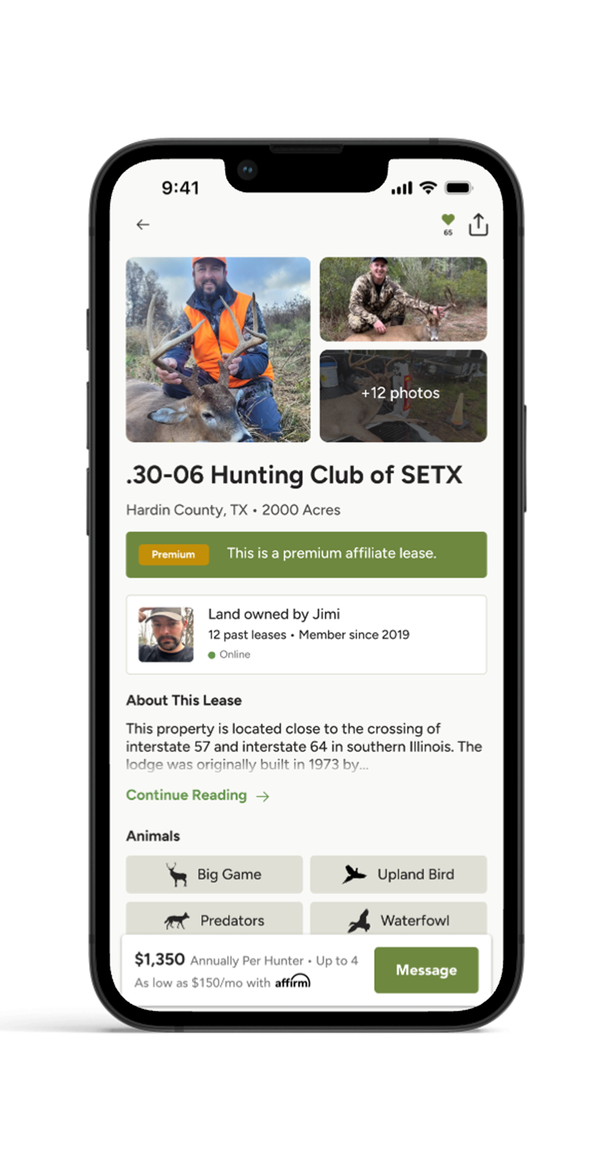
HLRBO is a marketplace that connects hunters with private landowners who lease land for hunting. I worked on Landkey, HLRBO's flagship transaction product designed to turn informal lease conversations into structured, protected, revenue-generating transactions.
The first version of Landkey gave landowners a way to generate contracts, add insurance, run background checks, collect signatures, and accept payment through HLRBO. But adoption was slower than expected because the flow depended on landowners initiating the process. After launch, we reversed the flow — allowing hunters to initiate a lease request and place a deposit — which generated roughly 400 lease requests in a single weekend.
Context
HLRBO helps hunters find private land to lease for hunting. Landowners list their properties, and hunters browse available land, message landowners, tour properties, and eventually lease access.
HLRBO's business model depended on helping those leases happen through the platform. Before Landkey, the marketplace helped users discover each other, but the actual lease process often happened outside the platform — relying on messages, phone calls, paper contracts, offline payments, and separate insurance or background check processes.
HLRBO did not just need to help users find each other. We needed to help them complete the transaction safely, confidently, and through the platform. Landkey became the product that connected all of those steps into one leasing workflow.
Users
We designed for two sides of the marketplace: landowners and hunters.
Landowners
Landowners controlled the supply — they owned or managed the properties and decided who leased their land. We identified two distinct landowner personas:
Passive Owner Patrick
Distant or less-engaged landowner leasing land as a low-effort, income-generating asset.
BehaviorsPrefers vetted, respectful lessees; mixes emotional connection with financial logic; may reside on or near the land.
NeedsReliable screening, easy-to-use communication tools, simplified contracts and secure payments.
Hunters
Hunters brought the demand. They wanted access to quality private land, a fair deal, and the confidence that the property would be theirs before someone else claimed it.
What they want
Access to well-maintained private land that matches their hunting style — whether that's whitetail, waterfowl, or upland game.
How they think
Urgency-driven. Good land goes fast, and hunters know it. They want to secure a property before the season starts or before someone else does.
How they operate
Often lease as a group, splitting costs across a hunting club or group of friends. Decisions involve multiple people.
What they need
Clear terms, a trustworthy process, and confidence that their money and commitment are protected from the start.
The Problems
Before designing Landkey, we knew the existing lease process was fragmented and risky for both sides. Users were not just dealing with a clunky digital experience — they were navigating a disjointed real-world transaction with legal, financial, and safety implications.
The leasing process was disjointed
A typical lease could involve several disconnected steps:
Hunter found a property on HLRBO
Hunter messaged the landowner
Landowner responded manually
Both sides negotiated terms
Someone created or reused a contract — if they even used one at all
Parties coordinated signatures
Hunter paid through an offline method
Insurance and background checks happened separately, if at all
That meant users could discover land on HLRBO but complete the most important part of the transaction somewhere else.
Payments felt insecure
Hunters didn't always know if their payment would actually secure the lease. Landowners didn't always know if a hunter was serious until money changed hands. This created trust issues and weakened the marketplace. If HLRBO wanted to own the transaction, payment needed to feel secure, trackable, and connected to the lease process.
Contracts were inconsistent
Many leases relied on outdated, incomplete, or informal contracts. Some landowners had their own agreements. Others handled terms through messages. That created risk — hunters and landowners needed a clearer way to define lease terms, responsibilities, dates, rules, payment expectations, and who was allowed on the property.
Protections were limited
Hunting leases involve real liability. People are entering private land with weapons, vehicles, equipment, and sometimes groups. Landowners needed confidence that they were protected. Without a structured system, protections were inconsistent. Landkey gave HLRBO a way to bring insurance, background checks, signatures, and payment into one connected process.
HLRBO had already helped hunters and landowners find each other. Landkey needed to help them safely complete the lease. This insight shaped the first version of the product.
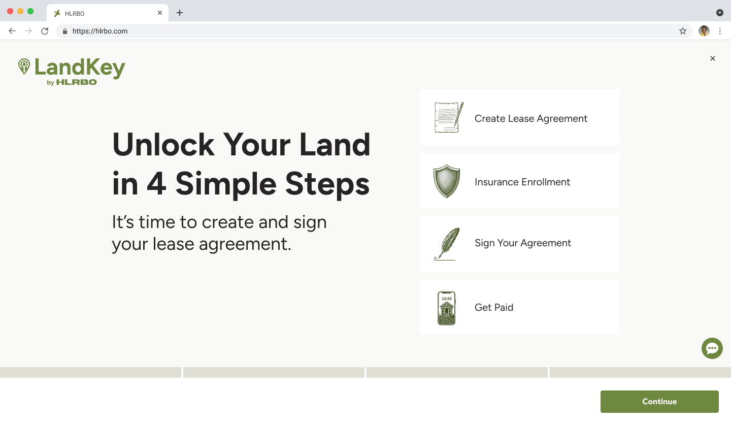
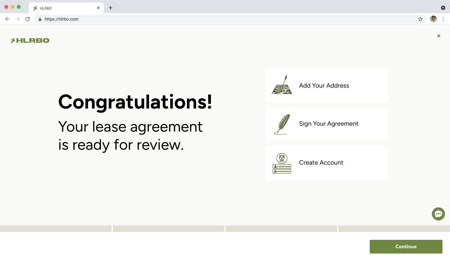
Design Iterations: V1 Landkey
The first version of Landkey focused on creating a complete transaction system for hunting leases. The flow allowed a landowner to:
Generate a lease contract
Add insurance
Send the lease to a hunter
Collect hunter information and additional hunters
Run background checks
Collect signatures
Accept payment through HLRBO
Tradeoffs in V1
Standardized leases over custom contracts
We did not support custom leases in V1 because we wanted as much of the transaction as possible to happen through HLRBO. This kept the flow cleaner and more consistent, but created friction for landowners who already had contracts they trusted.
Landowner-initiated flow
We required landowners to start the lease because they controlled the property and terms. This preserved landowner authority, but placed the most effort on the least digitally active user.
Additional hunters did not need subscriptions
We allowed primary hunters to add others to the lease without requiring every hunter to subscribe. This reduced friction and protected lease completion, but left a potential revenue opportunity for later.
Stripe payments over checks
We used Stripe to keep payments fast, trackable, and connected to the lease workflow. Some landowners preferred checks, but manual payments would have slowed the process and reduced platform visibility.
Designs
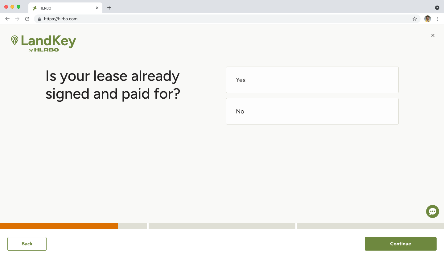
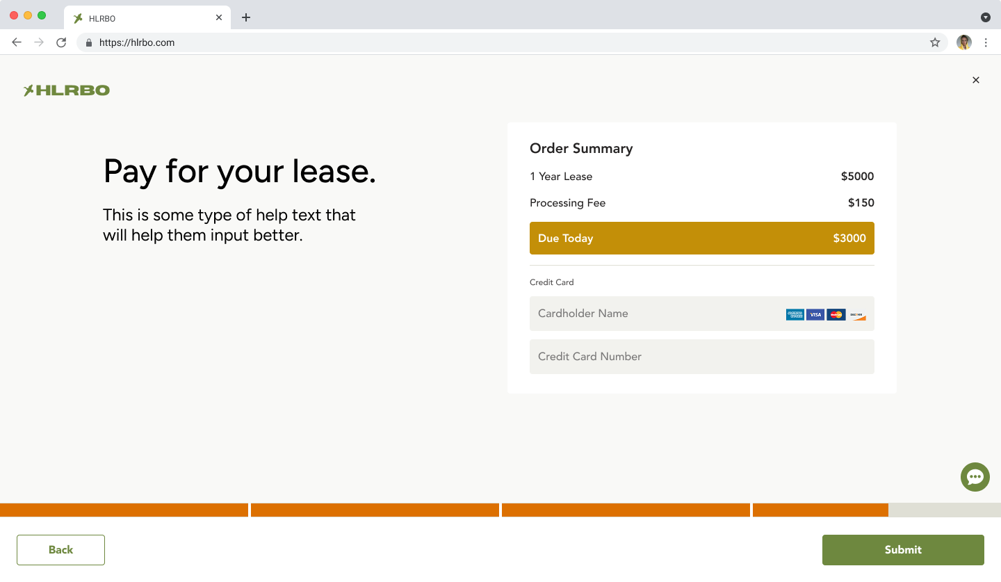
We added a screen before the actual flow to ask landowners if the lease was already signed. This helped us keep listings more up-to-date and collect data on how many landowners were completing transactions off-platform.
The landowner flow was framed as four steps: create the contract, answer insurance questions, send to the hunter to pay and sign, then return to the landowner for final signature. Technically more than four steps, but grouping them and showing the full picture upfront reduced drop-off by making the process feel manageable before anyone committed.
With this flow, we introduced a 14% facilitation fee on all listings — similar to how Airbnb surfaces fees to guests. The fee would show to hunters as part of the final price, but we wanted landowners to understand why their public listing price looked different from what they originally entered.
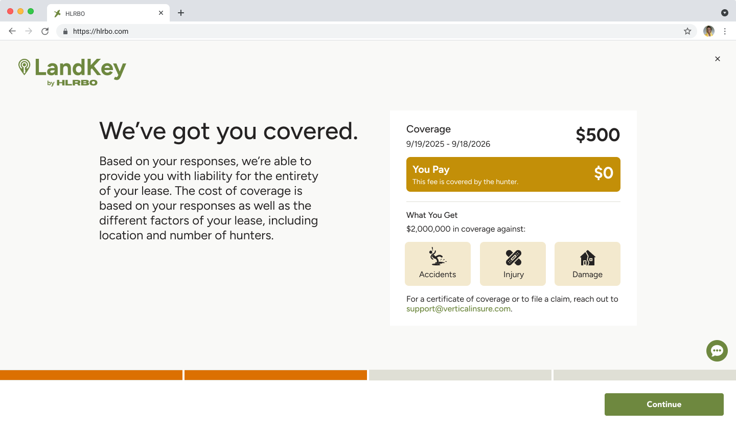
It's common in hunting leases for the hunter to cover the landowner's insurance. This screen showed landowners their coverage and confirmed they pay $0 — framing insurance as a benefit rather than a task. Making the $0 cost explicit was intentional: we wanted landowners to feel protected, not burdened.
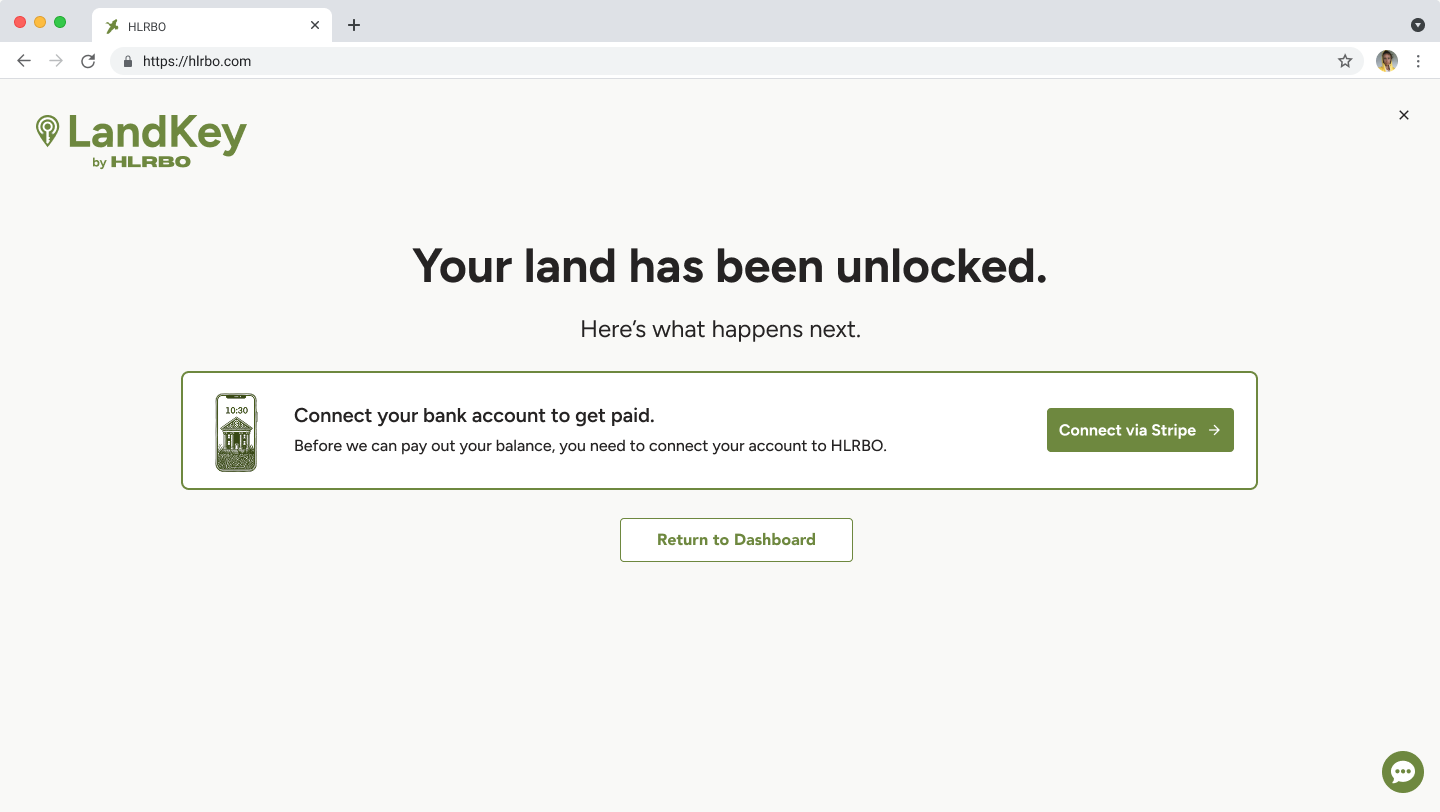
We originally placed the Stripe payment connection in the middle of the flow. It became a major drop-off point — many landowners weren't technical, didn't know what Stripe was, and didn't understand why they needed another account. Moving it to the end reduced abandonment while we worked toward a check-based payout option, which was their strongly preferred payment method.
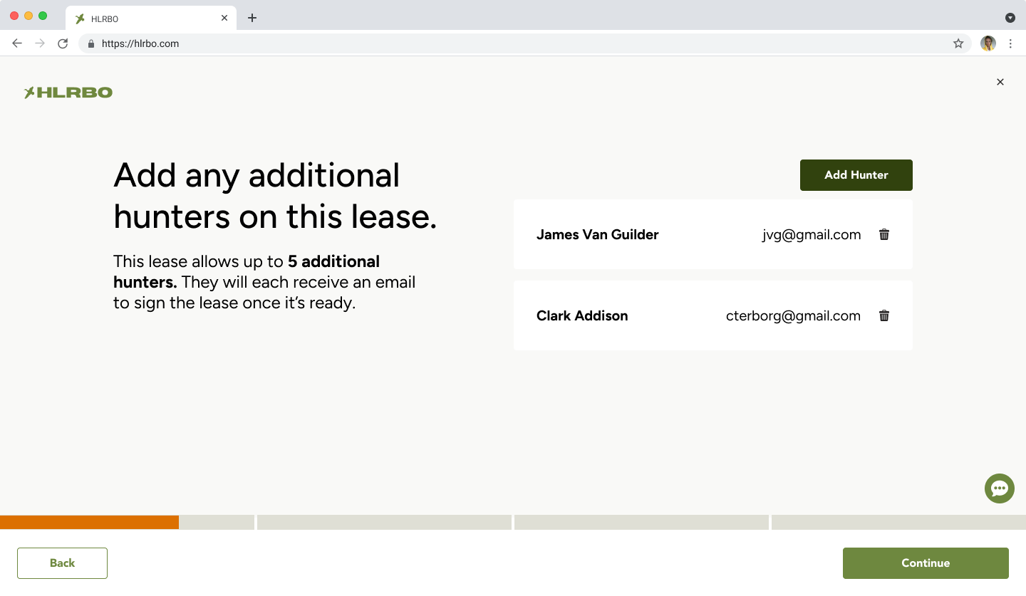
On the hunter side, the first thing a primary leaseholder had to do was add any other hunters to the lease. This ensured all parties were named on the contract and gave the landowner full visibility into who would be on their property.
When the primary leaseholder paid, they saw the lease cost, a processing fee, and insurance if applicable. We later introduced Affirm on this screen — a common complaint from hunters was that leases were too expensive, and installment payments helped address that without reducing landowner earnings.
We built email loops for each stage of the signing process — once one party signed, the next received a notification that it was their turn. After the primary leaseholder paid and signed, additional hunters were emailed to create accounts and sign. The added friction was intentional: building this user base supported our longer-term goal of marketing to group hunters and developing group plan pricing.
What We Learned After V1
After launch, Landkey was completing leases — but not as many as we expected.
3–10completed leases per week with the original flow
That was meaningful progress. Before Landkey, HLRBO had no visibility into whether a lease even happened — deals fell out of the platform into DMs, email chains, and paper contracts. But we knew we were leaving revenue on the table, and we had a hypothesis about why.
We knew the risk going in
From the start, we understood that placing the initiation burden on landowners was our biggest structural risk. Landowners controlled the supply, but they were the hardest users to activate — not always online, not always digitally comfortable, and often managing inbound interest with no real tools.
When we looked at what that actually looked like in practice, the signal was clear. Landowners were receiving hundreds of messages a day. We inventoried those messages and found that the most common one was barely a question at all:
"Is this available?"
That single pattern told us two things. First, hunters had real, active intent — they just had no structured way to act on it. They were reaching out manually because the product gave them nothing better to do. Second, it showed us how much noise a landowner had to filter through just to figure out who was actually serious about leasing.
And availability wasn't the only burden. Landowners were also negotiating terms, managing follow-ups, and tracking conversations across messages — before any formal process had even started. We needed to look more closely at where that friction was coming from and what we could do to reduce it.
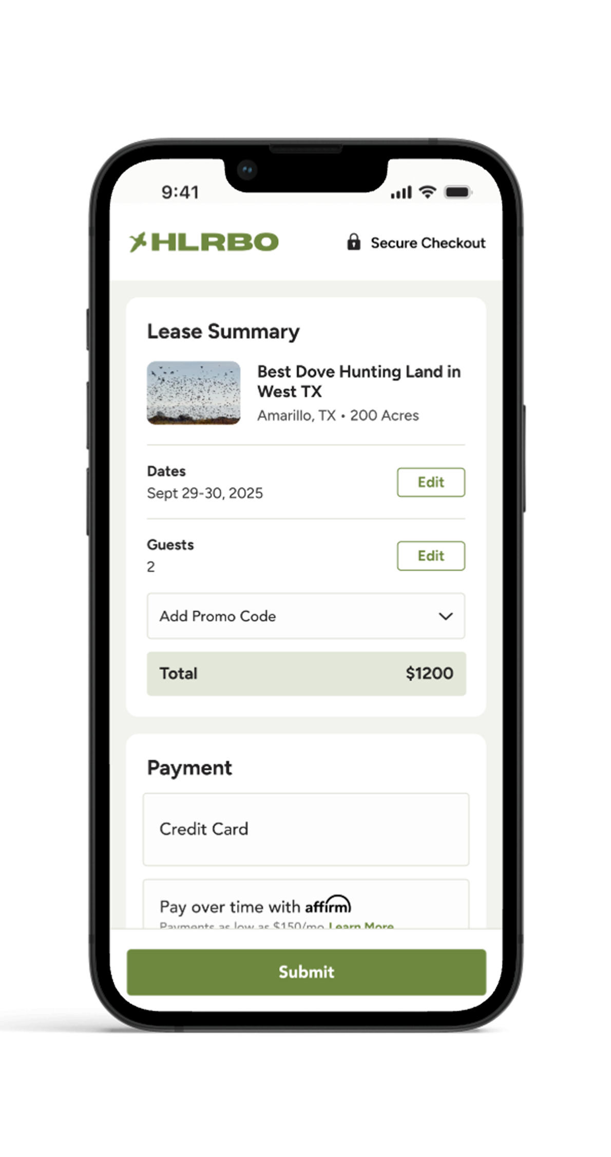
Iteration 2: Hunter-Initiated Landkey
The strongest signal came from the demand side. Hunters were already trying to lease properties through messages — they had intent, urgency, and motivation. They just had no structured way to act on it. So we reversed the flow.
The new flow
Instead of requiring landowners to generate the lease first, we let hunters initiate a lease request:
Hunter finds a property they want to lease
Hunter requests to lease it
Hunter places a deposit to show serious intent
Hunter adds supporting information
Request is sent to the landowner for review and approval
This preserved landowner control while removing the burden of starting the transaction from scratch.
Why this worked
Hunter-initiated Landkey worked because it aligned the product with existing behavior. We didn't ask hunters to learn something new — we gave structure to what they were already doing manually. The deposit helped separate high-intent hunters from casual inquiries, and moved lease intent out of noisy message threads and into a measurable transaction funnel.
Outcome
400lease requests in one weekend after launching hunter-initiated Landkey
36%reduction in inbound message volume for landowners after hunter-initiated flow launched
A lease request was not the same as a completed lease — but the spike showed that demand had been there all along. Based on HLRBO's transaction model (14% of lease value + $150 transaction fee), increasing completed leases from 5 to 30 per week could represent an estimated $7K–$21K in incremental weekly revenue depending on lease value. Presented as directional modeling, not confirmed revenue attribution.
Reducing Landowner Friction
Flipping the initiation model addressed the biggest bottleneck, but we also explored ways to reduce the operational burden on landowners more broadly — making more inventory transactable without requiring more effort from the supply side.
LiveBuilt with Claude
01
Landowner Calendar
We designed a landowner calendar to encourage short-term lease engagement. It helped landowners think about their property as available inventory rather than a static listing, and gave both sides a clearer way to engage around availability.
Live
02
Short-Term Bookings
We extended Landkey to support short-term leases — single-day or weekend hunts — giving landowners a way to monetize their property beyond annual contracts. This opened up a new segment of hunter demand and made more inventory accessible to casual hunters who weren't ready to commit to a full season.
Live
03
Schedule a Property Walk
We added a feature that let hunters request a guided walk of a property before committing to a lease. This gave hesitant hunters a lower-stakes way to engage, and gave landowners a qualified lead — someone willing to invest time before signing anything.
SlatedBuilt with Claude
04
Landowner-Uploaded Contracts
We allowed landowners to upload their own contracts, reducing friction for those who already had trusted legal language. This was especially important for hunting clubs, who made up a large percentage of our land listings and typically operated under their own long-standing agreements. Supporting their existing contracts was key to retaining that inventory on the platform. A deliberate tradeoff: we sacrificed some standardization in exchange for broader adoption.
ProposedBuilt with Claude
05
Hunter Q&A
We built an AI-generated Q&A module that surfaced common questions and answers directly on property listings. Hunters could get answers about access, rules, amenities, and availability without messaging the landowner — reducing inbound noise and helping hunters self-qualify before reaching out.
Reflection
Landkey started as a product to make hunting leases safer and more structured. It addressed real problems: insecure payments, inconsistent contracts, limited protections, and a disjointed transaction process.
But the first version taught us that solving the right problem is not enough. The workflow also has to match how users naturally behave. We originally designed around the user who owned the property. But the marketplace showed us that the user with the most intent was the hunter.
We also learned that product problems rarely have a single point of failure. Landowner disengagement wasn't just about a clunky flow — it was a compounding set of friction points: too many unqualified messages, no visibility into availability, no flexibility around contract formats, no low-stakes way to evaluate a hunter before committing. Addressing any one of those in isolation wouldn't have moved the needle. We had to think in systems — identifying the full landscape of friction and designing solutions that worked together to make landowners more reachable, more confident, and more willing to transact through the platform.
The person with authority is not always the right person to initiate the workflow. And a single fix is rarely enough — the most durable solutions address the system, not just the symptom.
Want to see more?
Turning Fragmented Outdoor Program Workflows into a Scalable Platform
Wildlife Connects / Texas Wildlife Association · Product Design
CompanyWildlife Connects / Texas Wildlife Association
ProductOutdoor Program Management Platform
My RoleProduct Design, UX Strategy, Workflow Architecture, AI-Assisted Prototyping, Design System Creation, Code-Adjacent Implementation
TeamsProduct Design (myself), Engineering (1), Product & Business Development (1), TWA Stakeholders
StatusIn Development
Redesigned a fragmented, manual process into a scalable platform architecture — reducing repeated application work, creating a more guided applicant experience, introducing clearer admin workflows, and building a reusable design system to support AI-assisted implementation. The platform supports TWA’s Adult Learn to Hunt program and Texas Big Game Awards, and is designed to adapt for other outdoor organizations with similar operational needs.
Context
Texas Wildlife Association is one of the largest landowner and hunter organizations in Texas. The organization supports wildlife conservation, hunting heritage, education, land stewardship, and programs that help new and experienced hunters engage with the outdoors.
One of those programs is the Adult Learn to Hunt Program (ALHP) — a multi-day educational hunt experience that includes firearms safety, harvest shot placement, mentoring, field skills, and wild game processing. Applicants are reviewed and contacted if selected to participate. Selected participants pay a $200 program fee and need an active TWA membership.
TWA also operates the Texas Big Game Awards, a statewide program that recognizes quality big game animals, land managers, hunting heritage, young hunters, and first-time hunters — promoting awareness of wildlife management and the role hunting plays in habitat conservation.
Before this project, TWA managed these workflows across disconnected tools: membership software, Google Forms, payment platforms, paper records, email, and files stored on employee machines. Wildlife Connects had already started building a digital platform for TWA, but the first version largely translated the existing manual process into software — and in doing so, introduced new friction instead of reducing it.
1,000+ALHP applications per year historically
150applications received in the first digital launch
15+questions required per hunt application, repeated for each hunt
That drop from 1,000+ to 150 applications signaled that the workflow needed to be rethought, not just redesigned visually. The challenge was bigger than digitizing one form — we needed to design a flexible platform that could support TWA’s current programs while giving Wildlife Connects a product foundation they could adapt for other outdoor organizations.
Users
We served several overlapping user groups. The primary focus was hunters and TWA admins, with scorers as a secondary priority for the Texas Big Game Awards.
Hunters
Applicants to ALHP ranged widely in age, experience, and digital comfort. Some were younger and familiar with online systems. Others were new to hunting, unfamiliar with program expectations, or unsure why they needed to complete prerequisites before knowing whether they would be selected.
NeedsA clearer explanation of each hunt; a simpler application without repeating long forms; transparency around waitlists and status; better notifications; a more guided path through prerequisites.
Admins
TWA admins managed applications, participant eligibility, waitlists, hunt assignments, score verification, and program reporting. Their workflows were highly manual and depended on disconnected tools, paper forms, spreadsheets, and local files.
NeedsA centralized way to review applicants; less manual sorting and assignment work; better eligibility and waitlist visibility; structured data for reporting; a platform that could scale as programs expanded.
Scorers
Scorers support the Texas Big Game Awards by measuring and submitting animal scores. Some are hunters, landowners, or certified experts. The scoring process includes domain-specific rules, multiple animal categories, and different scoring methods.
NeedsA clearer digital score submission process; reduced manual entry and calculation friction; support for different scoring standards and animal categories; a workflow that preserved proven methods without reinventing them.
Landowners and volunteers were also important but were not the immediate priority for the first version. Future expansion into youth programs introduced additional architecture considerations around permissions, dependent profiles, and account ownership.
The biggest user-model insight was that people could not be treated as fixed personas. A single person could be a hunter, volunteer, landowner, scorer, parent, or admin depending on the program. That meant the platform needed flexible role-based permissions instead of rigid user types.
Problems
I began by stepping back from the existing product and restarting discovery with TWA. Rather than treating this as a visual redesign, I treated it as a product architecture problem — meeting with stakeholders to understand goals, current workflows, program requirements, pain points, and future growth plans.
What we already knew
Programs relied on disconnected tools and manual processes across membership software, Google Forms, payment platforms, paper records, and local files.
Applicants had to complete the same 15+ question form repeatedly for each of up to three hunt applications.
Hunters had limited visibility into their status, waitlist position, or next steps.
Prerequisites created friction too early — applicants had to upload documents before knowing if they’d be selected.
Admins manually reviewed, sorted, verified eligibility, and communicated with applicants across disconnected systems.
Score submissions and verification for Texas Big Game Awards required tedious manual coordination.
What we wanted to learn
We needed to understand where applicants dropped off in the digital workflow; which steps needed to happen before selection versus after; how admins actually reviewed and assigned applicants; how waitlists and open spots worked in practice; how animal scores moved through intake, verification, and public presentation; and which data TWA needed for reporting, grants, and program evaluation.
Workflow and domain research
I facilitated whiteboarding sessions with TWA to map the larger ecosystem — how users entered the platform, how existing members might be invited, how future organizations could onboard, and how different programs needed to relate to each other.
For Texas Big Game Awards, I worked through the scoring lifecycle with TWA: score intake, category logic, verification, admin review, and public presentation. The real product problem wasn’t the scoring method itself — it was the operational flow around collecting, validating, and managing scores. We needed to create a better workflow without changing established standards.
Ideation
The original platform treated the project like a set of digital forms. I reframed it as a connected operational system — shifting the question from “How might we make the application form easier?” to “How should the platform manage identity, roles, applications, prerequisites, scoring, notifications, and admin review across multiple programs?”
That shift changed the direction of the product. We moved away from isolated workflows and started designing a platform that could support multiple programs under one ecosystem.
Reusable profiles over repeated applications
The first digital version required users to apply to each hunt individually and repeat the same long-form answers multiple times. I redesigned the flow around reusable user data — treating the hunter profile as the source of truth. Applicants could provide core information once, then carry that information across program opportunities. Hunt-specific questions could still exist, but the system would no longer force users to repeat the same long answers three times. This created a simpler applicant experience and a cleaner data model for admins.
Guided matching over open browsing
The previous product allowed users to browse a list of hunts and apply to individual opportunities. But many new hunters didn’t have enough context to know which hunts were right for them. We shifted toward a more guided application and matching flow — collecting preferences, eligibility, availability, and relevant background once, so admins could use that structured data to match applicants to the right opportunities rather than relying on manual sorting.
Prerequisites sequenced by application state
The first version required applicants to complete or upload prerequisites before knowing whether they would be selected — a major psychological barrier for first-time hunters who had to invest time and money before understanding their odds. I recommended moving some requirements later in the process. The platform still needed to track hunter education, licenses, health history, and signed documents, but those requirements didn’t all need to block the initial application.
Design Iterations and Feedback
Clearer application status states
Applicants previously had to check the platform manually to understand what was happening. Waitlist states were unclear, and users didn’t know when a spot opened or when they needed to act. I introduced clearer status states and notification triggers to turn vague program communication into a structured lifecycle — and give admins a more organized way to manage exceptions and follow-ups.
For Texas Big Game Awards, the problem wasn’t that scoring methods were broken — it was that the operational flow around score submission, verification, and presentation was manual and tedious. I explored ways to make score entry more guided without changing the underlying standards: reducing cognitive load, supporting multiple animal categories, accounting for different scoring methods, and making admin verification easier. This required balancing domain accuracy with usability — respecting established scoring practices while making the digital workflow easier to complete and review.
Further Design Iterations
AI-assisted design and implementation
AI became a major part of the process once I moved from workflow architecture into interface exploration. I used ChatGPT and Claude to understand complex domain workflows faster, explore alternative application and scoring flows, generate early UI concepts for dashboards, applications, account pages, and forms, and translate design ideas into working interface structures.
One important finding was that AI could generate functionality quickly, but it didn’t reliably preserve design intent. Engineers could feed Figma designs into Claude and produce working interfaces, but the output often diverged from the intended visual system, spacing, hierarchy, and interaction patterns.
That changed my approach. Instead of relying on static Figma handoff alone, I began creating a code-adjacent design system — using Claude to extract reusable components, type ramps, colors, buttons, fields, and badges from my designs, then building a Storybook-based component library. I published that system to GitHub and connected it to Claude so future AI-generated pages could reference the same components. This created a stronger bridge between design, AI, and engineering.
Building pages directly to support engineering
As the project progressed, I started moving closer to implementation. Rather than only handing off Figma files, I began building some of the redesigned pages myself using the design system, then preparing those structures for the engineer to integrate. This helped us move faster because the engineer already had working structures to start from, and I could directly influence the quality and consistency of the UI.
The goal was not just to make screens look better — it was to create a shared source of truth that could improve consistency, reduce rework, and help AI-generated implementation stay aligned with the product’s intended UX.
Finalized Designs
Designs in progress — coming soon.
Outcome
This project is still in development. Impact is measured by the product foundation created and the specific problems the redesign addresses.
Product Impact
Moves ALHP away from a repetitive, form-heavy process toward a guided program journey. Reduces duplicate application effort, gives hunters clearer status visibility, supports notification triggers, and sequences prerequisites more intentionally to reduce early drop-off.
Operational Impact
Reduces reliance on disconnected tools and manual workflows. Centralizes applications, participant data, and program status. Gives admins a clearer way to review and match applicants, reduces manual sorting, and improves record consistency.
Platform Impact
Creates a reusable product model for Wildlife Connects that can scale beyond TWA. Supports multiple programs within one ecosystem, flexible role-based permissions, and configurable data collection for different outdoor organizations.
Funding & Reporting Impact
Creates a stronger data foundation for TWA. Better structured program data supports reporting, storytelling, and future grant applications through state and federal funding programs — replacing records spread across forms, paper, and local files.
Post-launch metrics to track: application start-to-completion rate, drop-off by step, admin review time, waitlist response rate, prerequisite completion rate after selection, score submission completion rate, membership conversions from ALHP, and grant-reportable data points collected.
Reflection
This project pushed me to work beyond traditional product design. I had to understand messy operational workflows, model overlapping user roles, design flexible platform architecture, and use AI to move from ideas into implementation faster.
The biggest lesson was that AI can dramatically accelerate product development, but it also increases the need for strong systems thinking. Without a design system and shared component structure, AI-generated interfaces quickly become inconsistent. By creating a Storybook-based design system and connecting it to the AI-assisted workflow, I helped create a stronger bridge between design intent and implementation.
The result is a platform direction that solves the immediate needs of TWA while giving Wildlife Connects a scalable foundation for future outdoor organizations.
AI can dramatically accelerate product development — but it increases the need for strong systems thinking, not less. The design system isn’t a deliverable. It’s the infrastructure that keeps everything from drifting apart.
Want to see more?
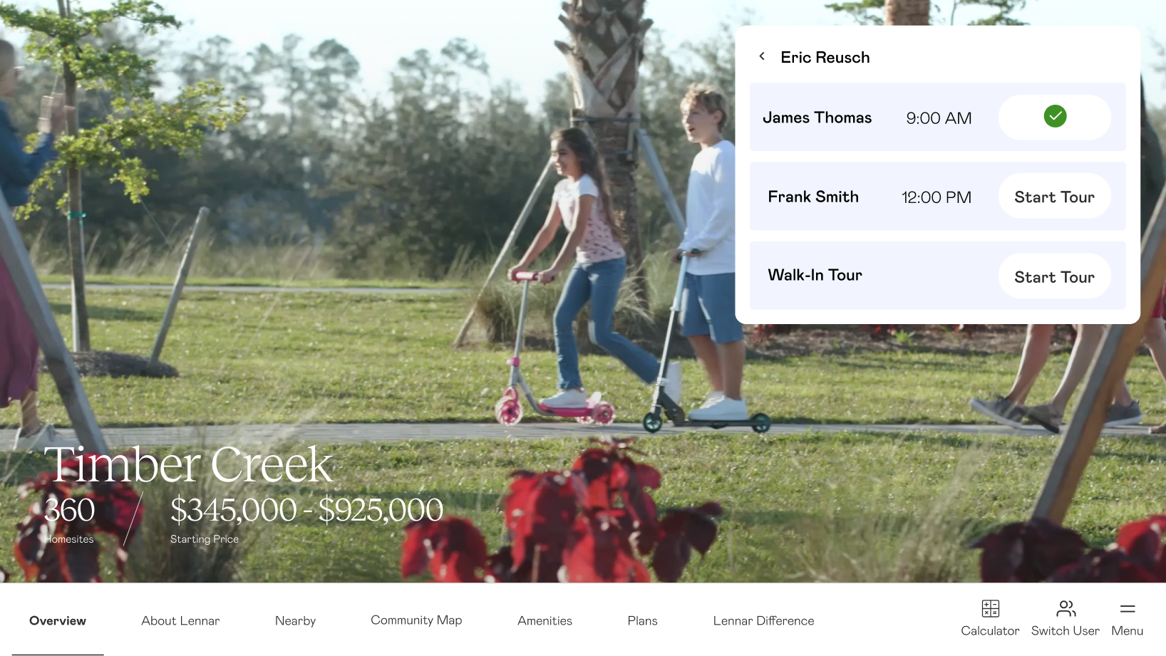
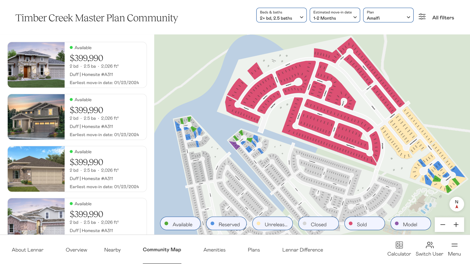
Unifying Sales Experience Across 40 Markets to Save $400,000+ in Fragmented Software Spend
Lennar’s “One Lennar” initiative set out to unify the virtual buying and selling experience across 40+ markets. I led UX design, strategy, and research for the Digital Sales Presentation — a platform designed to give every Lennar sales rep a consistent, polished way to take a prospective homebuyer from first impression to final decision. The goal wasn’t adoption by mandate. It was to build something reps would genuinely choose over the tools they were already using.
Context
Lennar is one of the largest homebuilders in America, building and selling over 80,000 homes each year. In 2020, Lennar hired an outside agency to build their Digital Sales Presentation tool — a platform designed to bridge the gap during the pandemic, when sales reps were unable to show homes in person.
However, as the pandemic passed and sales reps were back to showing homes in-person, their usage of the Digital Sales Presentation dwindled.
As the product designer on the Virtual Selling team that owned this platform, it was my job to understand why. We met regularly with division representatives to gather feedback on the platform. In one of those meetings, a sales representative told us that the platform did a poor job representing the Lennar sales method.
That comment changed the trajectory of our work on the product moving forward.
The Problem
The existing Digital Sales Presentation was built around exactly that — being a digital sales presentation. Based on high-level feedback, we knew we needed additional features to make it more useful outside of the pandemic era, like community maps. But even as we shipped those improvements, adoption remained low.
We were often told we would struggle to make progress because “each division sold differently.” Lennar was unique in its organizational structure in that it was similar to the United States; Lennar corporate built products and gave directives on company goals, but each individual division and region were like states that had their own funding, marketing teams, and ways of working.
The User
The users of the Digital Sales Presentation were Lennar’s NHCs — New Home Consultants. They were not realtors, but sales people trained specifically to sell Lennar homes. Some had previously worked in real estate, but many others had simply excelled in customer-facing roles and brought a natural ability to connect with people.
Problem 01
We learned that in a fast housing market, Lennar hired an influx of NHCs that they were not able to train at scale. This contributed to confusion around the product and disjointed sales processes.
Consultant Casey
Formerly a teller at their local bank, Casey became a Lennar NHC after being referred by a friend. She now lives in a Lennar community herself, and enjoys helping families find their dream home.
MotivationsSales quotas, Competitive markets, Representing their community
BehaviorsScrappy, Build their own Shadow Systems
NeedsReal-time inventory, System flexibility and trust
Research & Insights
My researcher and I flew to Florida to observe the division most vocal about the gap. We sat alongside sales reps as they walked homebuyers through communities — some nearly sold out, others still under construction. We watched them navigate between external vendor tools, foam boards, and printed availability sheets to cobble together a coherent presentation on the fly.
Every division insisted their approach was unique. After speaking with additional regions, we heard the same thing everywhere — that their market was different, their buyers were different, their communities were different. And they weren’t wrong about any of that.
But underneath the variation, we found a pattern. Nearly every successful Lennar sales rep followed the same core sequence when a buyer walked in the door.
The proven sales method
01
Make a Friend
You’re not selling — you’re getting to know them. Understand their needs and what’s bringing them in.
→
02
Start Big, Zero In
Narrow from the big picture down to the personal.
Lennar as a builder
⌄
Location & community
⌄
Amenities
→
03
Show the Home
Show Good, Better, and Best — never more than 3 homes. By now, they already know.
“Our homes aren’t different from many of our competitors. If you focus on home specs, the buyer focuses on price. We sell the experience of buying from Lennar.”
This shaped everything we built. Two principles guided the design:
The community map was non-negotiable — it wasn’t just a sales aid, it was how most reps tracked what was actually available to sell.
The screen should stay out of the way. Reps needed to move fast, surface the right content, and keep the conversation with the buyer — not the interface.
Our goal became to build a standardized sales presentation that scaled to fit the needs of 40 divisions across Lennar — engaging enough to delight the user, but utilitarian enough to stay out of the way.
The Original Interface
The landing page for the DSP was a table that included an NHC’s appointments. The issue we found was that this interface was geared towards virtual appointments. Most NHCs were in fact selling across different communities, but typically only selling one community at a time. This added unnecessary friction to the experience, and was a less-than-desirable view for homebuyers to see on the screen.
The landing screen for a community was a static image. The navigation only had a few links depending on the community, focused on the floorplans and the virtual tour — again, very focused on giving tours virtually. It also showed navigation buttons on the right-hand side that most NHCs did not understand at first glance.
Floorplans were the primary means of exploration in the old version of the DSP. We learned that very few NHCs focused on floorplans, even in communities without amenities. The focus was more so on homes and the location of the home within the community.
The Everything’s Included tab was simply a tab filled with text and pictures to highlight Lennar’s promise of including all of the basic features in a home that many other builders charge for. However, this varied by division and therefore was not something to be included in all tours.
The amenities tab was an overlay present for those communities that had amenities. While this was often something that was done on-site, divisions still wanted a way to showcase these to learn what interested the homebuyer. Having a large carousel of images was too time-consuming and not engaging.
The only map available in the Digital Sales Presentation was in the context of a community, and showed very little information around availability and pricing on the map itself. For NHCs who used these maps as a single source of truth for their inventory, this wasn’t enough to help them sell.
The recap was a feature that was great in theory, but was only applicable to sessions happening virtually.
Design
We structured the platform around the proven sales sequence. We designed the product around the idea that an NHC can pull up any community on any device and guide a tour for any homebuyer.
The entry point was a community video, which was immersive enough to act as a screensaver when no one was in the room, and strong enough to set the tone when a buyer walked in. We built an experience where an NHC could find their name and select their appointment so that the session was recorded, and saved items could be added to a recap later on.
In the spirit of going wide and narrowing in, the first tab was dedicated to showcasing Lennar. This was important as NHCs told us that many homebuyers fear purchasing in a community that never gets finished, or buying in an area that is rural and underdeveloped. This screen was meant to briefly assure the homebuyer that with the size of Lennar, they can buy homes in the best areas where property values will hopefully increase over time.
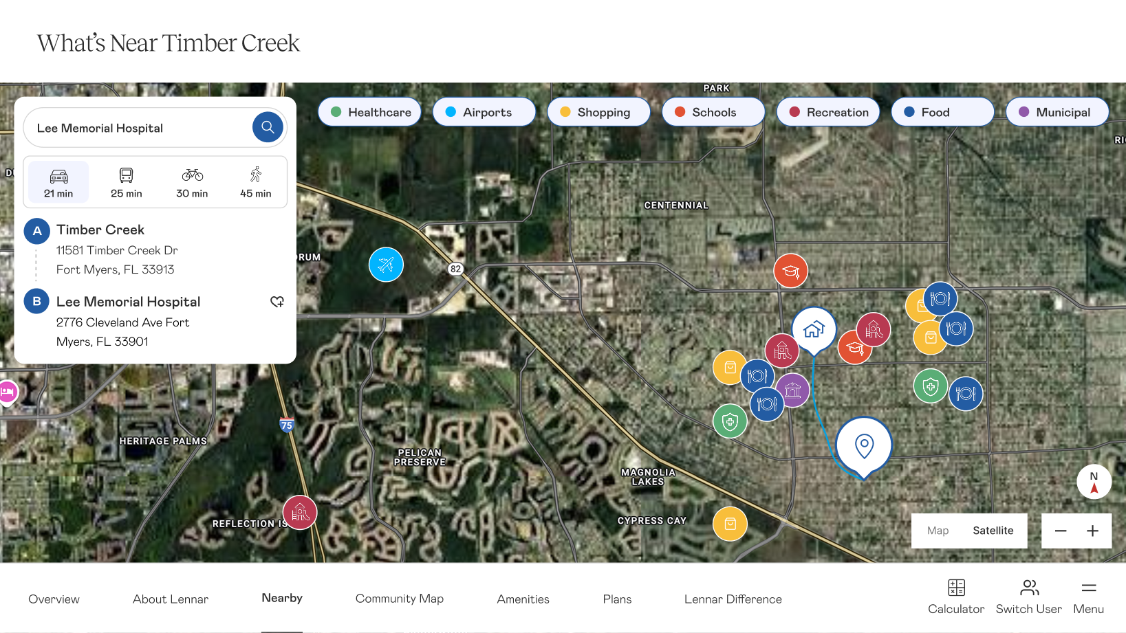
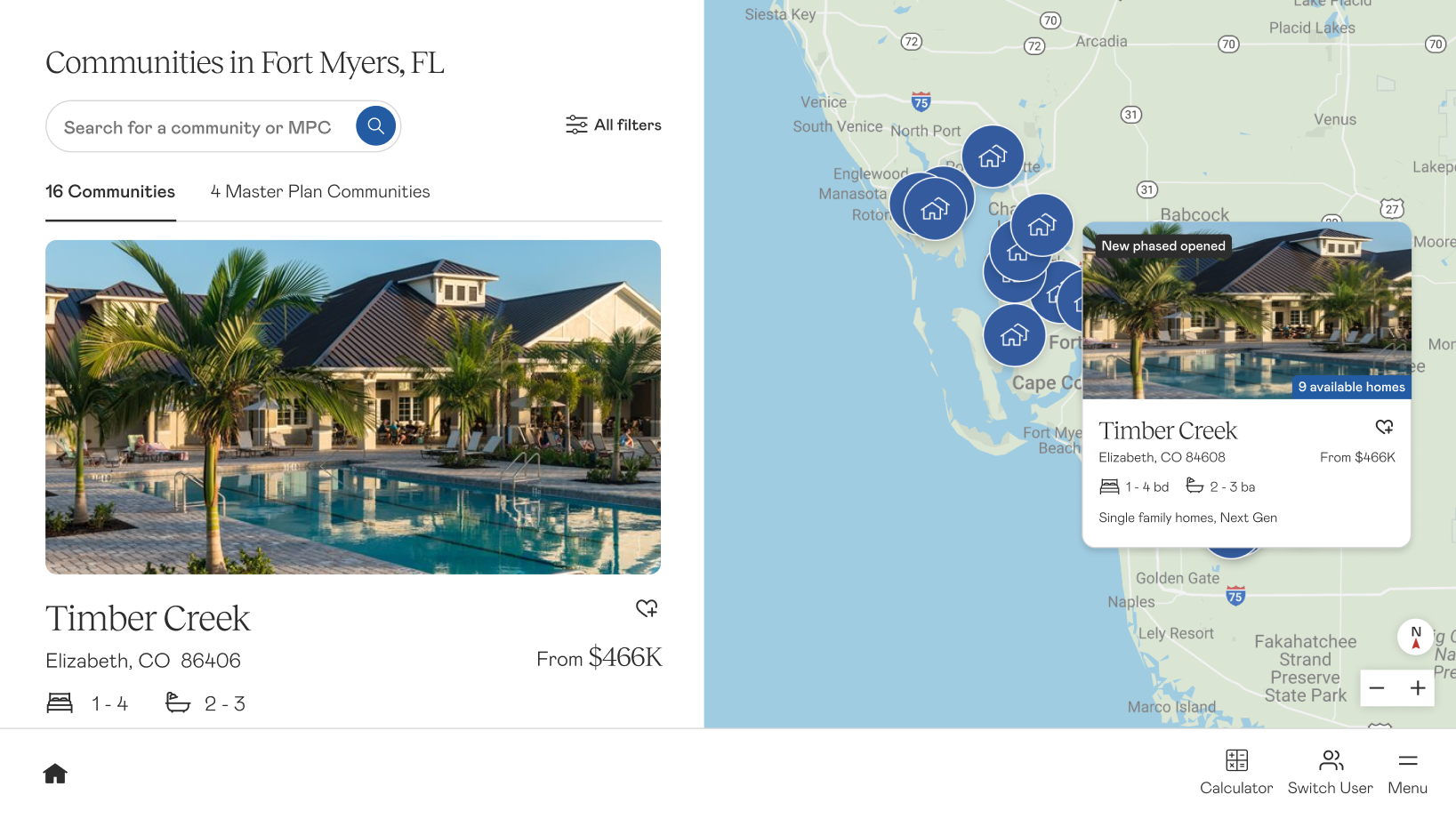
The Nearby map showcased the area to give homebuyers an idea of what their life would be like when they moved to the area. We built in a feature that would allow an NHC to search for a specific spot — maybe a relative, school, or new job — that could then be added to the recap. The goal was to help the homebuyer begin to envision their life in the area.
The map, and the most important screen, contained full views of each community’s inventory. NHCs could filter based on homebuyer specifications, and see relevant available homes on the left-hand side. Clicking into a specific tile on the map could also show in-depth details about a homesite, and be favorited to show in a recap.
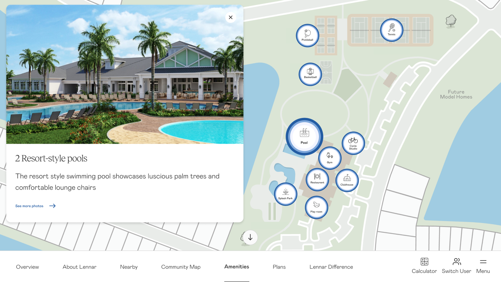
The amenity map showed the standard amenities map with interactive bubbles that allowed an NHC to drill in and get more details and photos on the specific amenity.
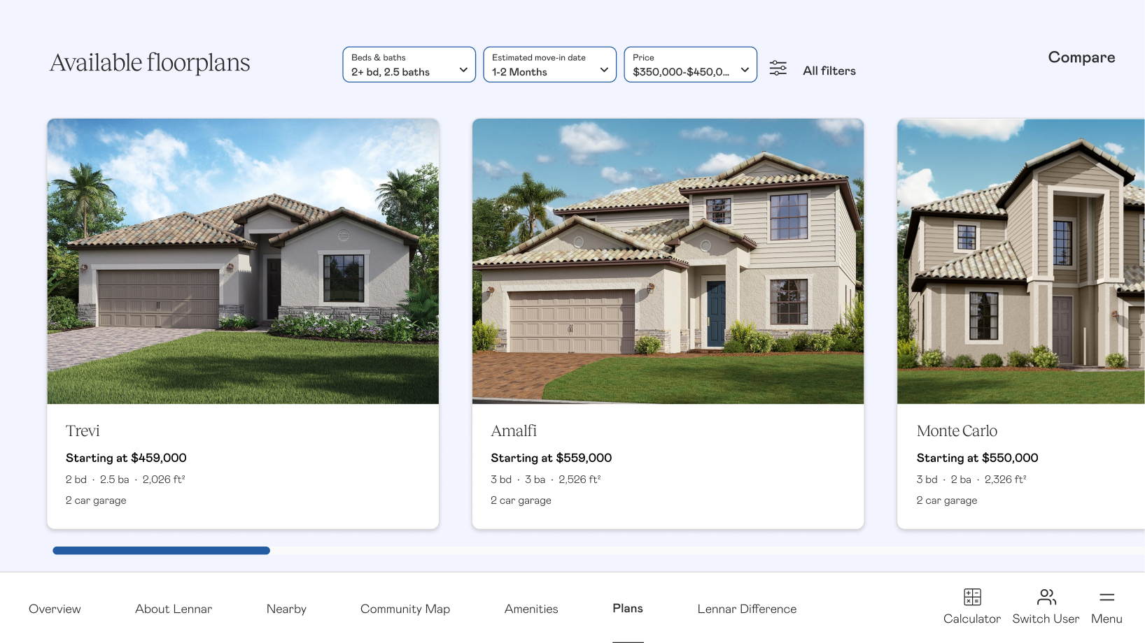
The floorplan page was more image focused and prioritized availability. Since we learned that the most common scenario that this page would be needed would be when a buyer was struggling to decide between two homes, this was the access point of the beloved comparison feature that allowed an NHC to compare multiple floorplans.
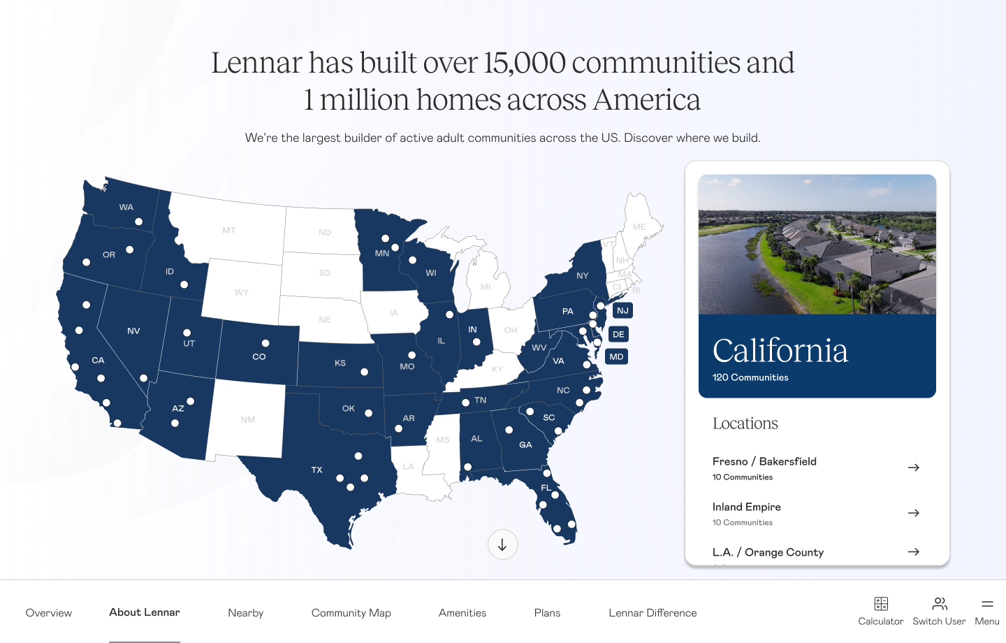
Lastly, in the scenario a homebuyer wanted a home in a different community, the NHC could access the division map from the menu. This was a visual way to display the breadth of coverage in an area while allowing for an NHC to quickly find communities nearby that fit the buyer’s needs.
The platform also included a dynamic amenities map, a mortgage calculator, a compare feature, and session tracking — so reps could send buyers a personalized recap of everything they’d seen together once the tour was over.
Rollout required close partnership with sales trainers to get reps comfortable with the new flow. But because the platform reflected how reps already worked — rather than asking them to change — adoption took hold across divisions. The DSP became the foundation for a broader sales rep ecosystem, eventually connecting lead tracking, tour history, and follow-up workflows across Lennar’s internal tools.
Outcome
40+markets adopted the Digital Sales Presentation, replacing third-party and custom-built tools
$400Ksaved annually as divisions rolled off external vendor platforms
4 mofrom kickoff to initial rollout, laying the foundation for the broader sales rep ecosystem
Reflection
Every division told us their market was unique. And they were right — the communities were different, the buyers were different, the competitive context was different. The mistake would have been to dismiss that and push a one-size-fits-all solution.
What research revealed was that the variation was real, but it was mostly surface-level. Underneath it, reps were already doing the same things in the same order — they just didn’t have a shared language for it, and they certainly didn’t have a tool built around it.
The platform succeeded because it reflected how reps already sold, rather than asking them to sell differently. “One Lennar” wasn’t achieved by mandating uniformity — it was achieved by finding what was already uniform and building something that honored it.
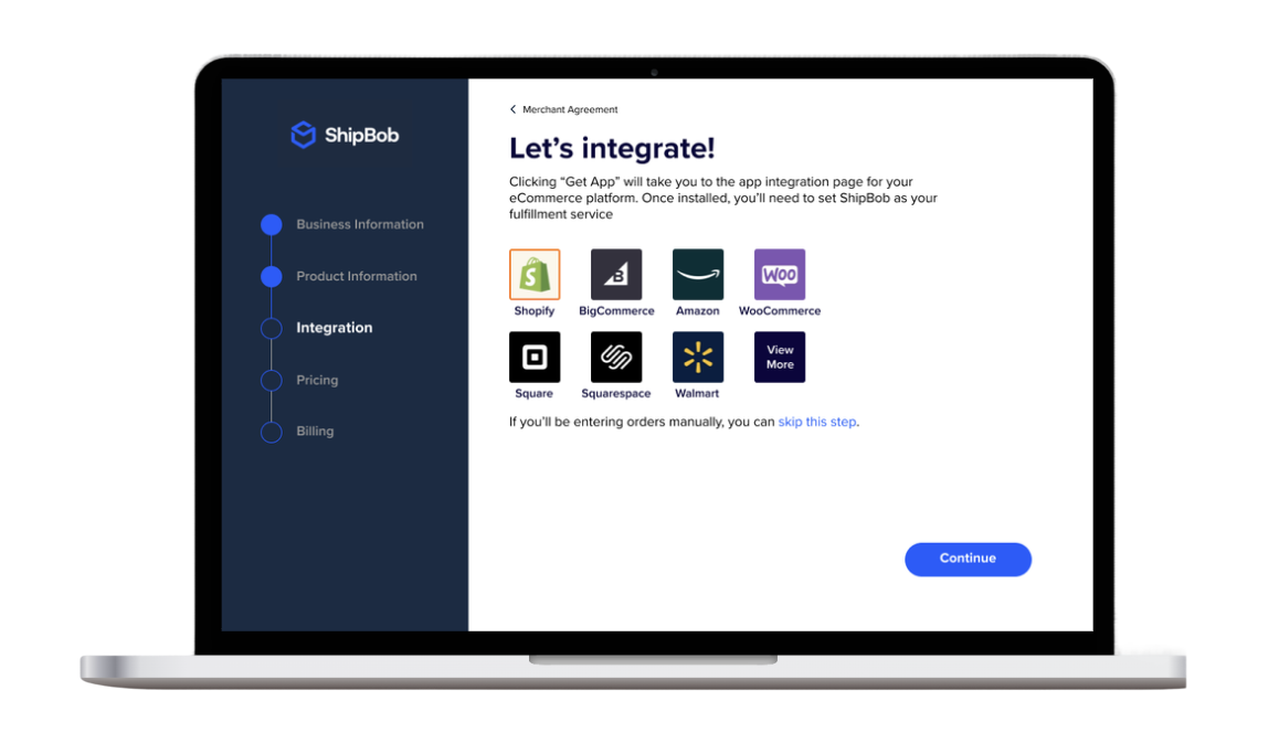
ShipBob’s Growth Team identified a critical activation gap: merchants who submitted a warehouse receiving order converted at 80% — but most never got there without help. The self-service onboarding was failing the people who drove the most revenue. I led UX design, strategy, and research on a full onboarding redesign that increased warehouse receiving order creation by 24%, improved overall conversion by 20%, and cut the average time to send inventory by a third.
Context
ShipBob’s Startup Stella persona — small merchants with straightforward logistics needs and very little time to spare — represented 22% of new revenue in Q2 and 58% of all active merchants on the platform. Getting Stella to submit a warehouse receiving order (WRO) was the single most important activation moment in the onboarding flow. Merchants who submitted a WRO converted to shipping their first order at 80%. The problem was that most never got there on their own.
The Growth Team set a target of increasing WRO submission by 10%. What we found in research suggested the gap wasn’t a motivation problem — it was a design problem.
User
The redesign was scoped to ShipBob’s Startup Stella persona — the merchant segment that made up the majority of the platform and whose activation behavior made them the highest-leverage target for onboarding improvement.
Startup Stella
Early-stage merchant with straightforward product lines and big growth ambitions, but little time, little logistics experience, and a tight budget. Stella isn’t looking for a logistics partner with every feature — she needs one that gets her up and running fast without making her feel like she needs a manual.
MotivationsGet products to customers quickly, avoid operational overwhelm, find a fulfillment solution that grows with her business.
BehaviorsSelf-service by default, limited time for onboarding, unfamiliar with logistics terminology, highly cost-conscious and quick to compare alternatives.
NeedsTransparent pricing she can evaluate quickly, a setup flow with no unnecessary steps, and a clear path to shipping her first order without needing to call support.
ScaleRepresented 22% of new revenue in Q2 and 58% of all active merchants on the platform.
The Problem
The data told a clear story. On average, it took 33 days from sign-up to a merchant sending their first inventory shipment — time the business couldn’t afford to lose. Nearly a third of all support tickets were basic account setup questions, meaning the onboarding was generating ongoing operational cost. Pricing confusion alone accounted for 16% of tickets, and ShipBob was issuing over $10,000 in refunds for inventory that arrived unshippable because merchants hadn’t been properly qualified upfront.
33avg. days from sign-up to sending inventory
31%of support tickets were basic account setup questions
16%of support tickets were about confusing pricing
$10k+in fees returned for unshippable inventory
Research & Insights
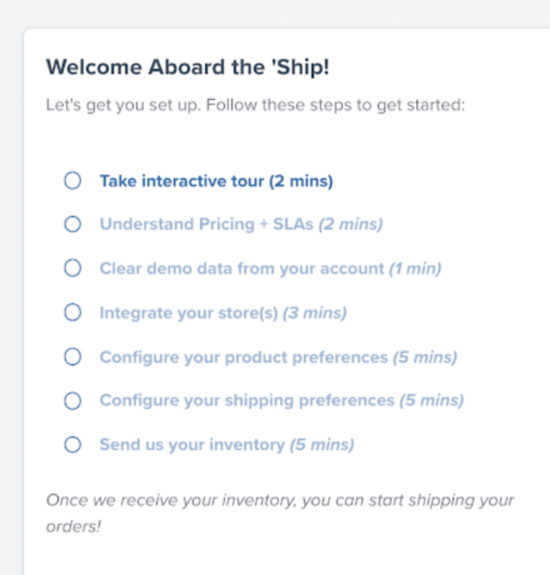
I ran moderated interviews with real merchants — a first for ShipBob — and paired them with support-ticket analysis and behavioral data. When merchants signed up, they entered a little about their business — their name, their order volume — and were dropped into a dashboard that was essentially empty except for one thing: a seven-step onboarding checklist. Watching merchants move through it made the drop-off impossible to miss.
The entire post-sign-up experience: a seven-step onboarding checklist.
01
Take an interactive tour
Every merchant skipped it entirely.
02
Understand pricing
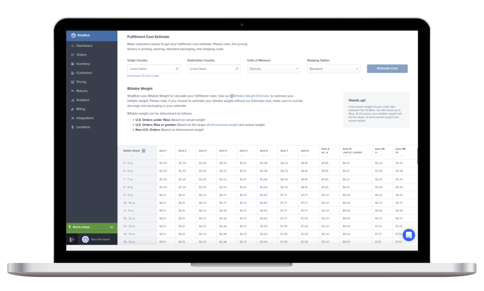
This opened a giant pricing table. Merchants knew zone pricing, but not why ShipBob’s was different: where most 3PLs nickel-and-dime with add-ons, ShipBob’s was all-inclusive. As their only pricing touchpoint, the dense table just made ShipBob look more expensive.
03
Clear the demo data
Sample data was there to show how the platform worked — but none of the merchants wanted to use it.
04
Integrate your store
Here, every merchant hesitated. The steps felt like they were getting progressively more serious — asking for real commitment — while merchants still didn’t understand how the process actually worked.
The giant pricing table — a merchant’s only interaction with pricing, which made ShipBob look more expensive than its all-inclusive model actually was.
The Approach
Everything we learned pointed to three goals for the redesign.
01
Increase Sign-Up Conversion
We were losing merchants at the very first step. Adding social proof set expectations early, and stripping out redundant fields removed friction at the door.
02
Increase WRO Submissions
Submitting a warehouse receiving order was our clearest indicator of conversion. We removed non-essential steps and qualified inventory upfront to get more merchants to that moment.
03
Decrease Time to Send Inventory
Once a merchant’s inventory reached the warehouse, ShipBob could start shipping. We worked to cut the days between sign-up and that first shipment — largely by making pricing clear earlier in the flow.
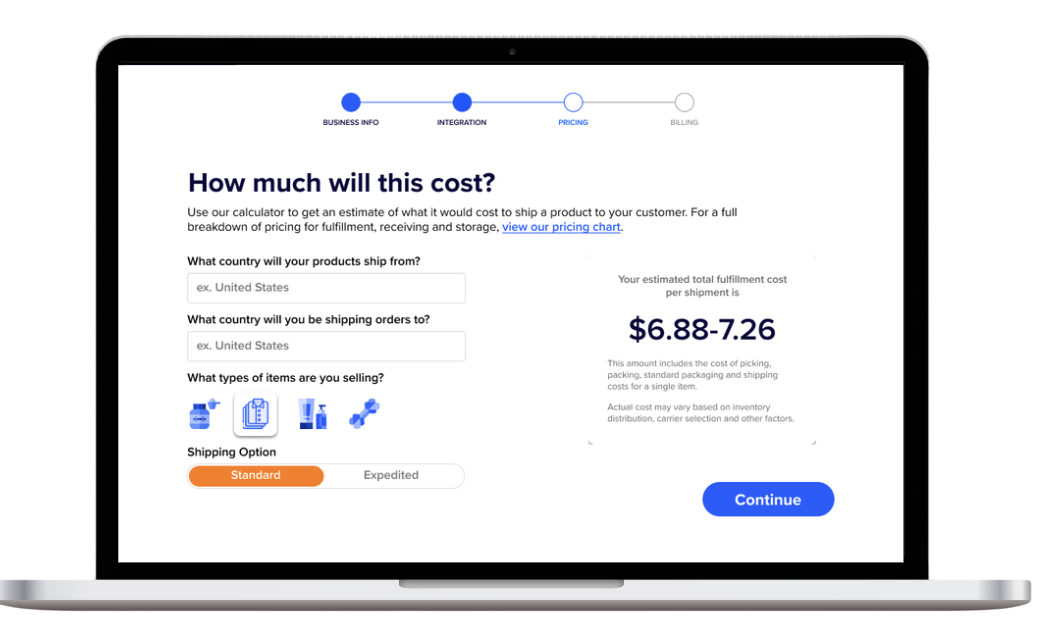
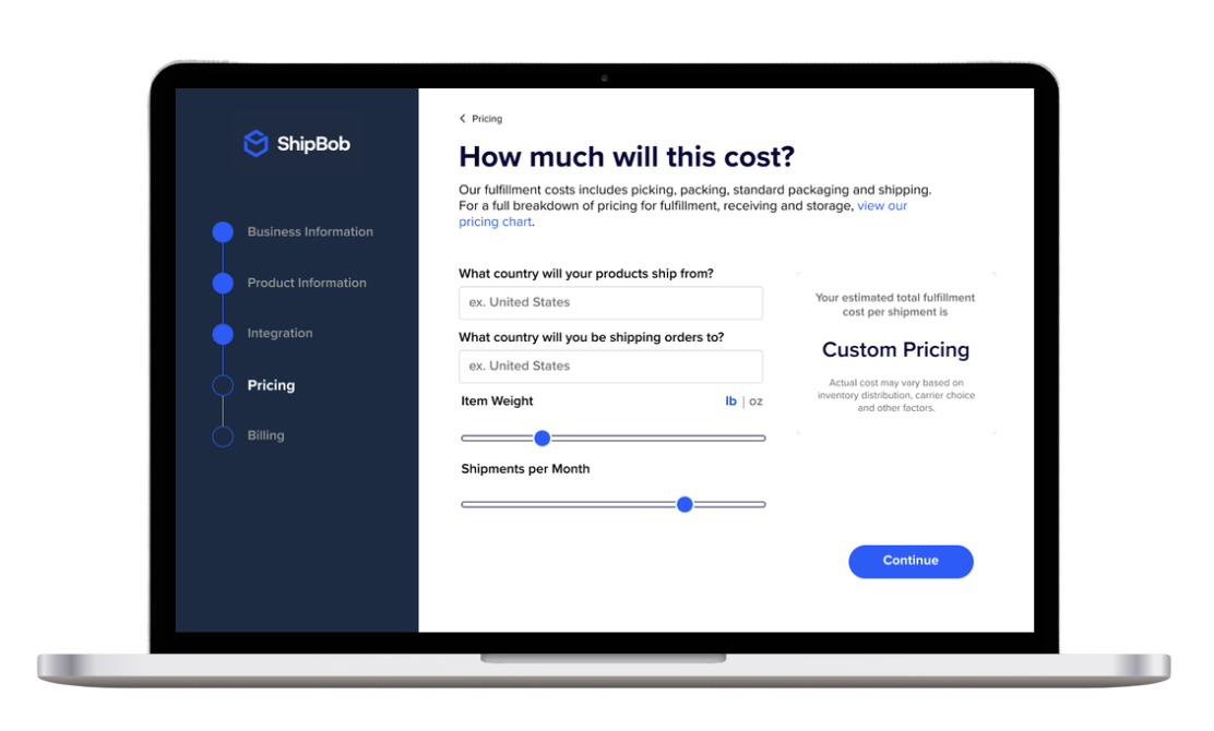
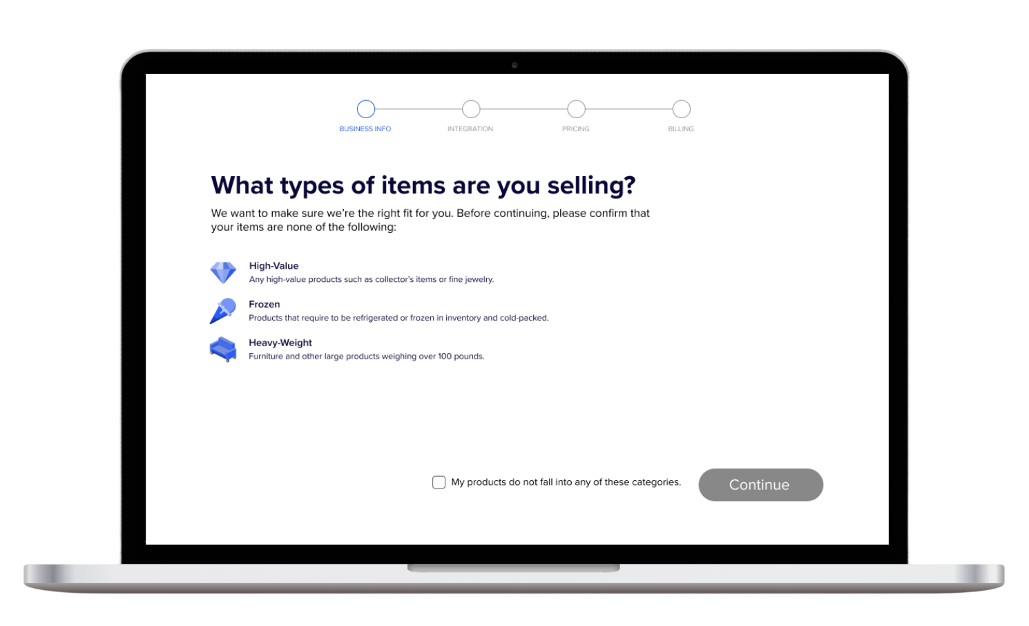
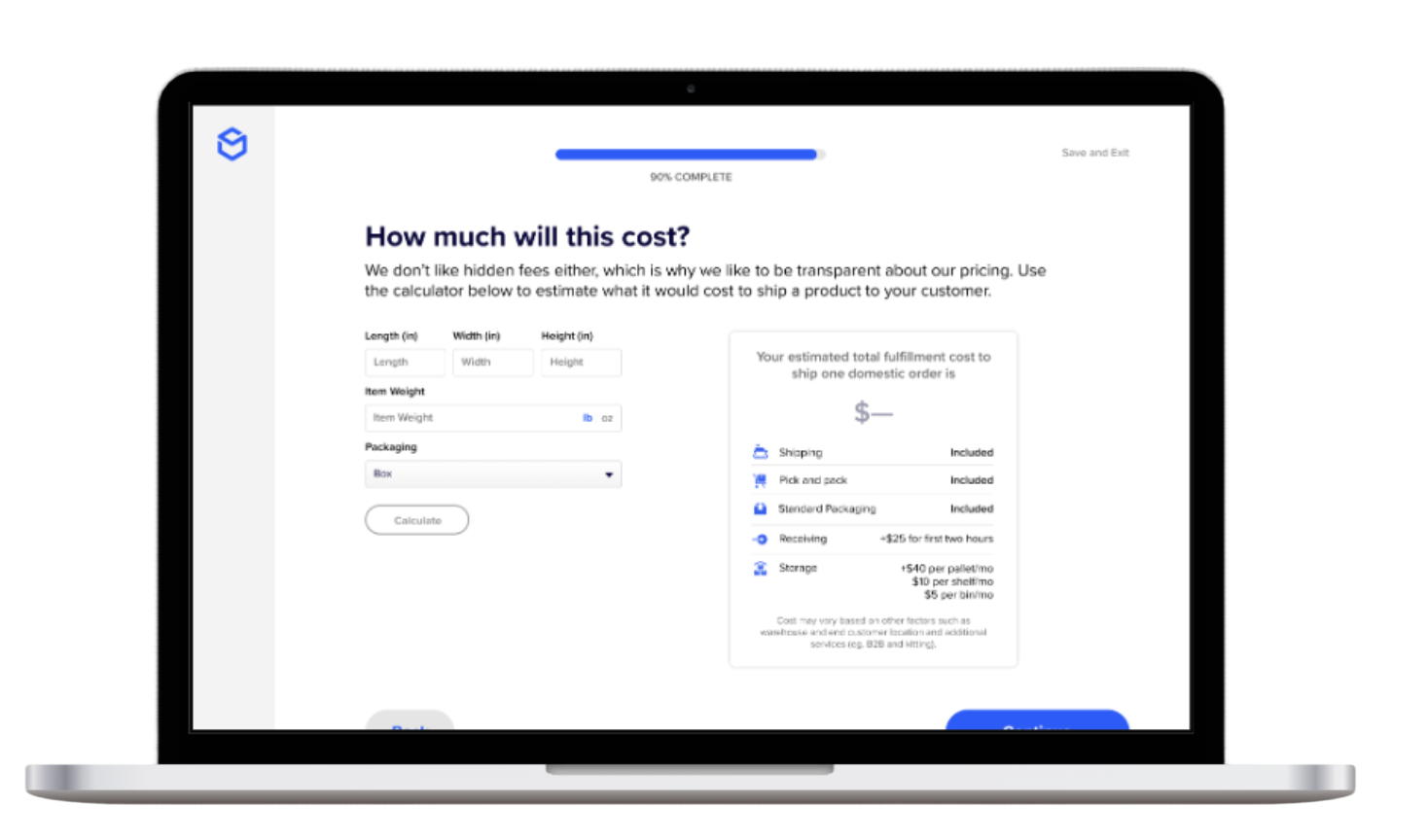
Design
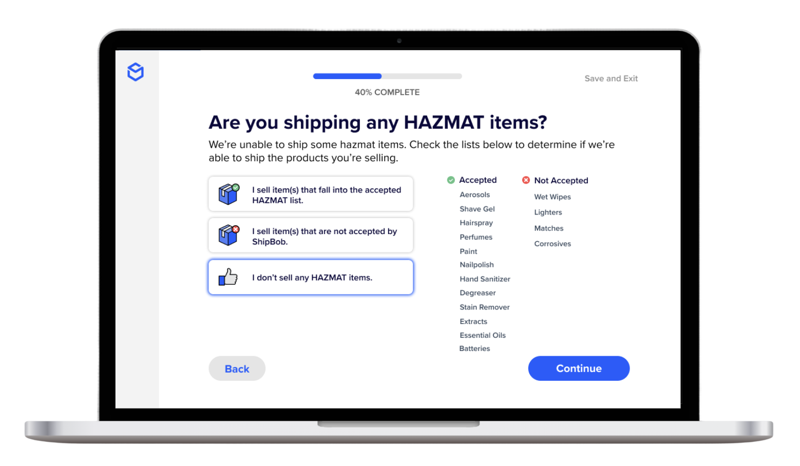
The first addition was a qualification step at the top of the onboarding flow. By asking merchants what they weren’t selling before they got any further, we could flag incompatible inventory types early — reducing refunds downstream and laying the foundation for a more tailored experience over time.
Next was the integration step. Though it was ultimately deprioritized due to engineering constraints, unmoderated testing surfaced a meaningful insight: merchants wanted to understand pricing before they connected their store. That finding directly shaped how we sequenced the rest of the flow.
The pricing calculator went through several rounds of iteration — category selectors, sliders, tiered displays. The challenge was communicating a nuanced pricing model without overwhelming small merchants, while still making sure larger merchants understood they qualified for volume breaks. The final version was a transparent breakdown of every cost factor — making ShipBob’s bundled value legible against competitors who charged extra for the same services.
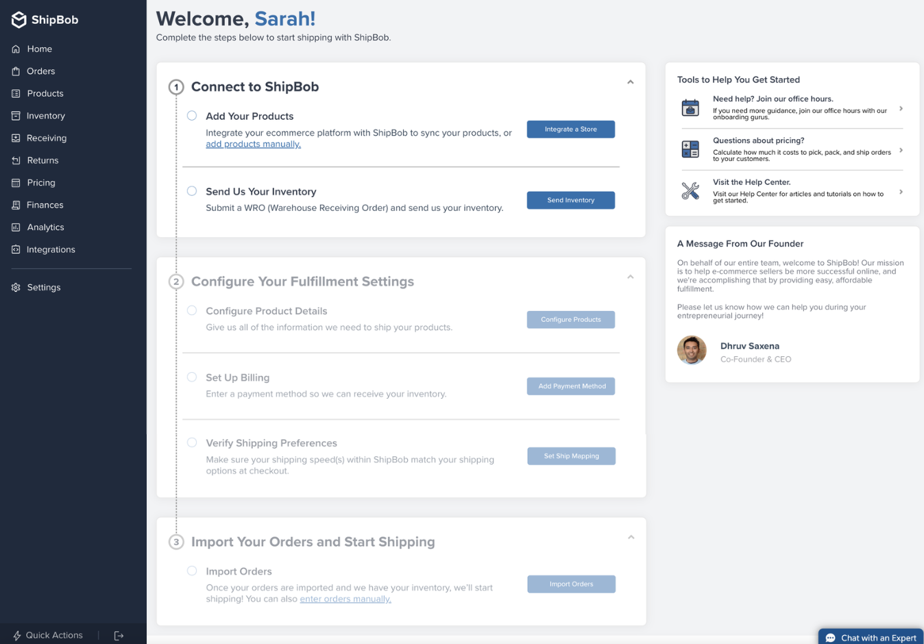
With steps moved out of the dashboard and into the onboarding flow, the post-sign-up experience could focus entirely on activation: adding products and sending inventory. Everything else could follow once merchants were live.
First Iteration
First iteration of the qualification step. We asked merchants upfront what they weren’t selling to flag restricted inventory types before they invested time in setup — reducing downstream refunds and creating a hook for personalization later.
First iteration of the store integration step. Though this was eventually deprioritized due to engineering constraints, testing this screen revealed that merchants wanted to see pricing before connecting their store — a finding that reshaped the entire flow sequence.
Early calculator iteration using category selectors. The challenge was making a nuanced pricing model scannable without dumbing it down — and making sure larger merchants could still see they were eligible for volume discounts.
Slider-based iteration. This version felt more interactive but tested poorly — merchants found sliders less trustworthy than fixed inputs when dealing with something as concrete as fulfillment costs.
Final Version
The refined qualification step. We reduced visual noise and reframed it to feel like a quick, helpful screen rather than a gate — something that set the merchant up for a better experience rather than slowing them down.
The refined integration step. Even in its deprioritized state, the research from this screen had lasting impact on how we ordered the rest of the onboarding experience.
The final calculator: a transparent, line-item breakdown of every cost factor. ShipBob was often perceived as more expensive than competitors — this screen made the bundled value visible, showing that many services others upcharged for were already included.
The redesigned post-sign-up dashboard. By moving account setup steps into the onboarding flow, the dashboard could focus on the two actions that drove activation: adding products and sending inventory. Everything else — store integration, advanced configuration — followed after merchants were live.
Outcome
24%increase in warehouse receiving order creation, surpassing the 10% target by more than double
20%improvement in overall conversion rate
33→22days to send inventory, reduced by a third
Some work was pushed outside of scope due to a shift in engineering resources. The project also established the value of moderated user research at ShipBob — making the case for a practice that had not previously existed on the team.
Want to see more?
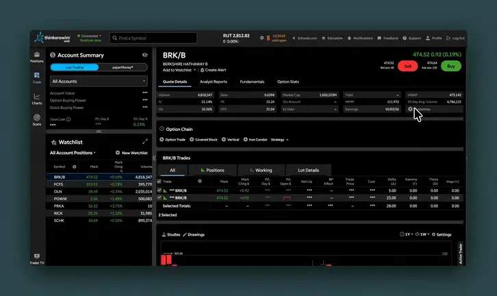
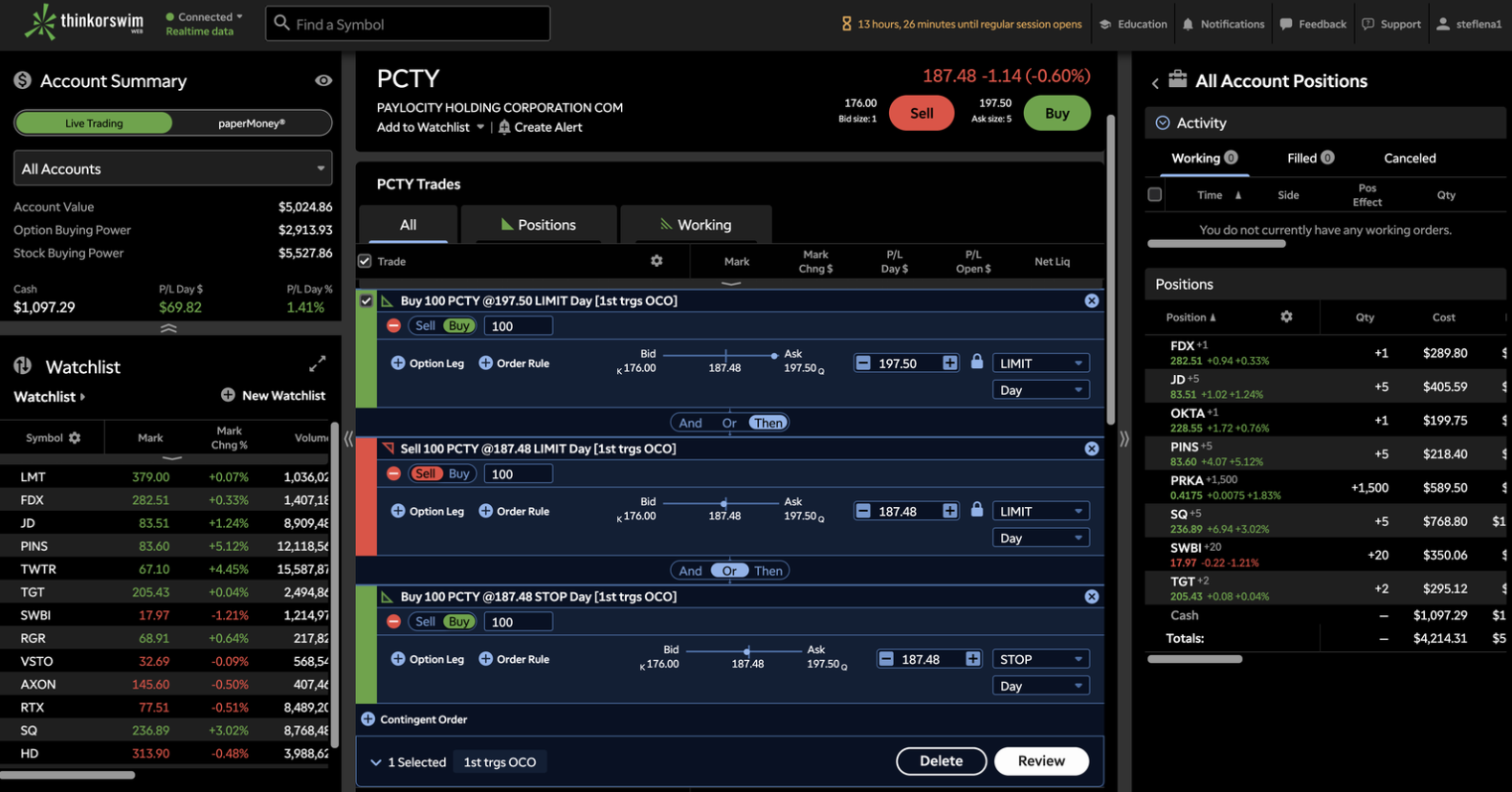
Reducing Complexity in the Trading Pathway for High-Volume Traders
TD Ameritrade · Product Design
CompanyTD Ameritrade
My RoleProduct Design, UX Strategy, Workflow Design, Research Synthesis, AI-Assisted Iteration
The ability to place "advanced orders" is a feature that allows active traders to place trades that trigger or cancel future trades, or place multiple trades at once. These trades accounted for 1% of trades overall but were placed by some of our most lucrative traders.
Advanced traders visiting the platform were consistently requesting some variation of these advanced orders since launch. This was a way to drive more trading revenue through the platform, as well as provide feature parity with Schwab platforms and an accessible solution for advanced orders for thinkorswim users.
Context
thinkorswim web was the web-based companion to the thinkorswim desktop and mobile apps. With desktop and mobile being heavy, data-dense platforms, the web-based platform faced an opportunity to be a lighter, usability-friendly, and accessible version that people could use at work. Prior to its launch, we worked to add features on a weekly basis so that the platform could reach parity with its predecessors.
Advanced orders — trades that trigger or cancel future trades — accounted for just 1% of all trades, but were placed by the platform's most lucrative traders. These power users had been requesting the feature since launch, and the platform needed it for both compliance and competitive parity. We opted to build this before other requested features given this, as well as the fact that markets were volatile and other features were bottlenecked due to engineering constraints.
This feature also had the potential to increase trades, assuming the end result was more options or futures contracts. This meant more revenue being generated from the platform.
The Problem
I conducted user research with active traders and internal employees to understand how they thought about advanced order types. I wanted to learn if and how users were interacting with this feature on our existing platforms, and what their mindset was around placing these types of trades.
01
They did not know what they were or how to place one.
02
It did not fit their trading style.
03
They did not trust the system to place their trade correctly.
💡 While we couldn’t change whether it fit their trading style, we could provide more clarity to help them understand how these orders worked and build trust in the system.
The User
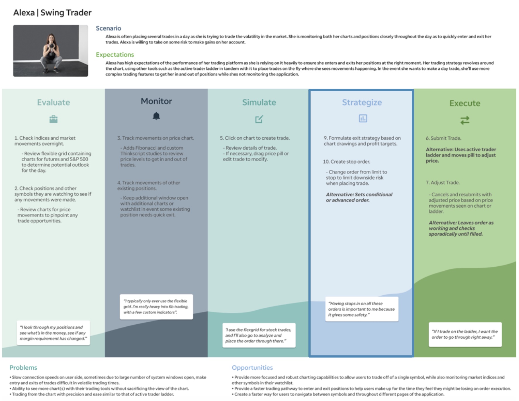
Swing traders who needed advanced orders to automate their trading strategies used these to capture quick price movements. Movements may take place as quickly as intraday, or sometimes over the course of 1–2 weeks. These types of order builds occur within what we called the “Strategize” step of the journey as the user is gauging the level of risk they're willing to take on before submitting their trade.
Speed is of the utmost importance.
Trying to capture price movements based on charts & market volatility.
Decision occurs is assessing risk levels during “strategize” step of path.
Movements may take place as quickly as intraday, or over the course of 1–2 weeks.
Journey Map Artifact for the thinkorswim Web Swing Trader
Existing Experience
Desktop
Pros
Great for advanced power users who want to get in and out of trades quickly.
Cons
Intimidating for new users and other types of traders to understand and locate.
Mobile
Pros
Easy to understand relationships between trades.
Great for novice traders.
Cons
Too manual for core user base to quickly place trades.
thinkorswim Web had the opportunity to bridge the gap between platforms by optimizing for both speed and clarity.
Competitive Research and Ideation
Competitive Research
Because thinkorswim is one of the most powerful trading platforms on the market, it was difficult to look for inspiration directly from competitors. Most only had a few of these “advanced orders”, and therefore didn’t have a UI capable of the necessary complexity. One competitor, WeBull, had 4 types of orders that could be controlled by toggle. While internal employees told me this was a smooth experience, it still was not scalable to thinkorswim’s capabilities.
Sketching Through the Complexity
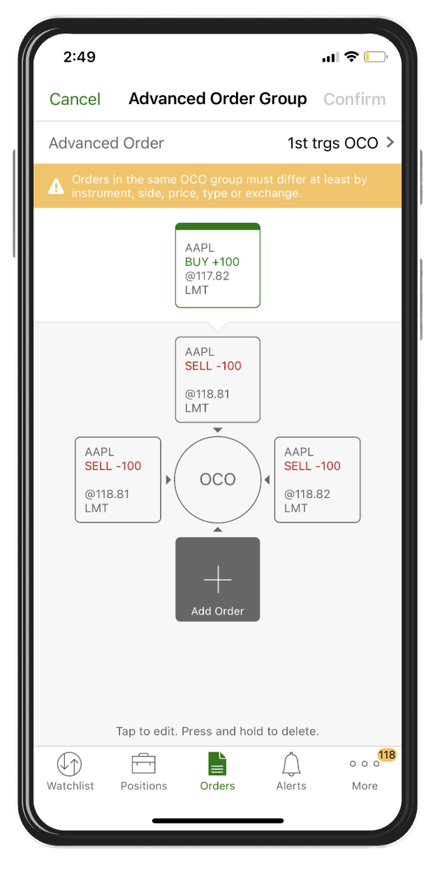
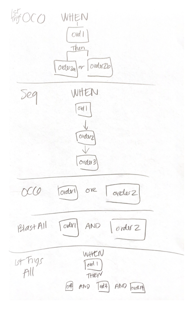
After competitors fell short, I knew I had to think outside the box for a solution. In order to do this, I knew I had to understand these trades more deeply. I worked with my product owner to understand each of the different trades. In writing all of them down, I began to notice a pattern. WHEN order 1 gets placed… THEN, Order 2a OR Order 2b gets placed. I began to notice a pattern that reminded me of conditional logic that spanned across each of the trade types.
Hunting for Inspiration
After I found this pattern, I went on the hunt for inspiration outside of the brokerage industry. I found sleek UI’s for condition builders, and found one experience that included a toggle, not just as a way to control the conditions, but also as a way to show relationships between the items it was connecting.
The Solution
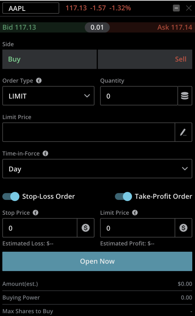
I took inspiration from the conditional logic builder to build this toggle into the trade ticket. My assumption was that it was quick enough for an advanced user to toggle between different order types, but provided clarity to newer users about what the relationships were between the different trades they'd be placing.
After sharing the first iteration internally, I received feedback that it wasn't clear what the relationship was between the trades, and that the buy/sell wasn't clear enough given the colors and the ability to remove trades (via the checkbox). That led me to the second iteration on the right, where I removed the checkboxes, added color and text to indicate the buy and sell legs of the trade, and centered the toggle with “connected” to make the toggle more prominent.
“This one is pretty simple to follow. It’s just the logical conditions to put in what happens — what are the conditions based on triggering the next order. So, if I want the subsequent orders to only be considered when the buy order triggers, I would hit “THEN”. And then on the two sell orders, I guess the “AND” option wouldn’t apply, unless I have a different type of order. If the question is do I understand what this does, then yes, it’s pretty self-explanatory.”
Feedback and Iterations
The feedback in user interviews was overwhelmingly positive, with users both experienced and novice stating that the toggles we had them use helped them understand the purpose and relationships between the trades.
Once we validated the concept, I continued to make concepts for edge cases like the one seen below. While it was an edge case, our platform was primarily built for option traders. This solution was not only flexible enough to accommodate option trades, but also could be integrated with other order types we'd be adding down the line.
Reflection
While we did not have robust reporting in place to quantify advanced trade usage, the launch was still a meaningful step forward for thinkorswim Web. It closed a key feature gap between web and desktop, expanded what active traders could accomplish without switching platforms, and reinforced our broader product strategy: bringing the power of desktop trading into a faster, more accessible web experience. The result was a complex trading workflow redesigned into an experience that felt approachable enough for newer advanced traders, while still preserving the control and flexibility experienced traders expected from thinkorswim.
Outcomes
Achieved feature parity with Schwab’s “Contingent Orders,” a key requirement post-acquisition
Built a scalable foundation for future enhancements
Want to see more?
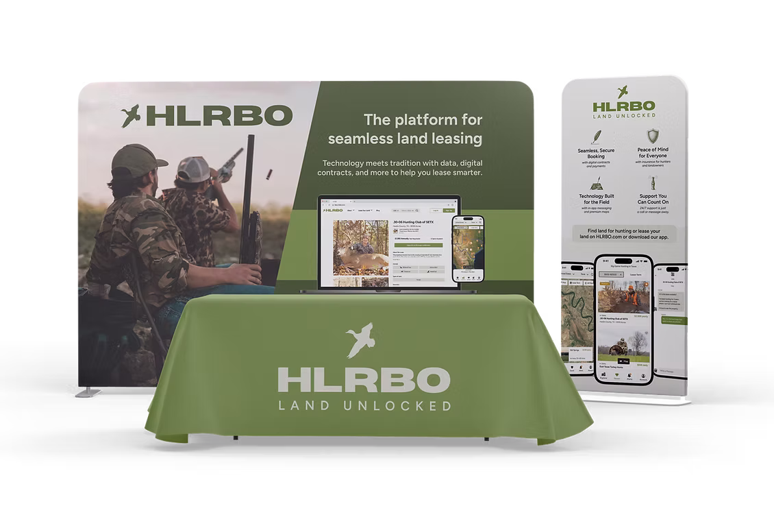
HLRBO
Marketplace · Mobile App
HLRBO is a marketplace connecting hunters with private landowners. I designed the mobile app from scratch — bringing land discovery, listings, and lease management into a mobile experience built for hunters.
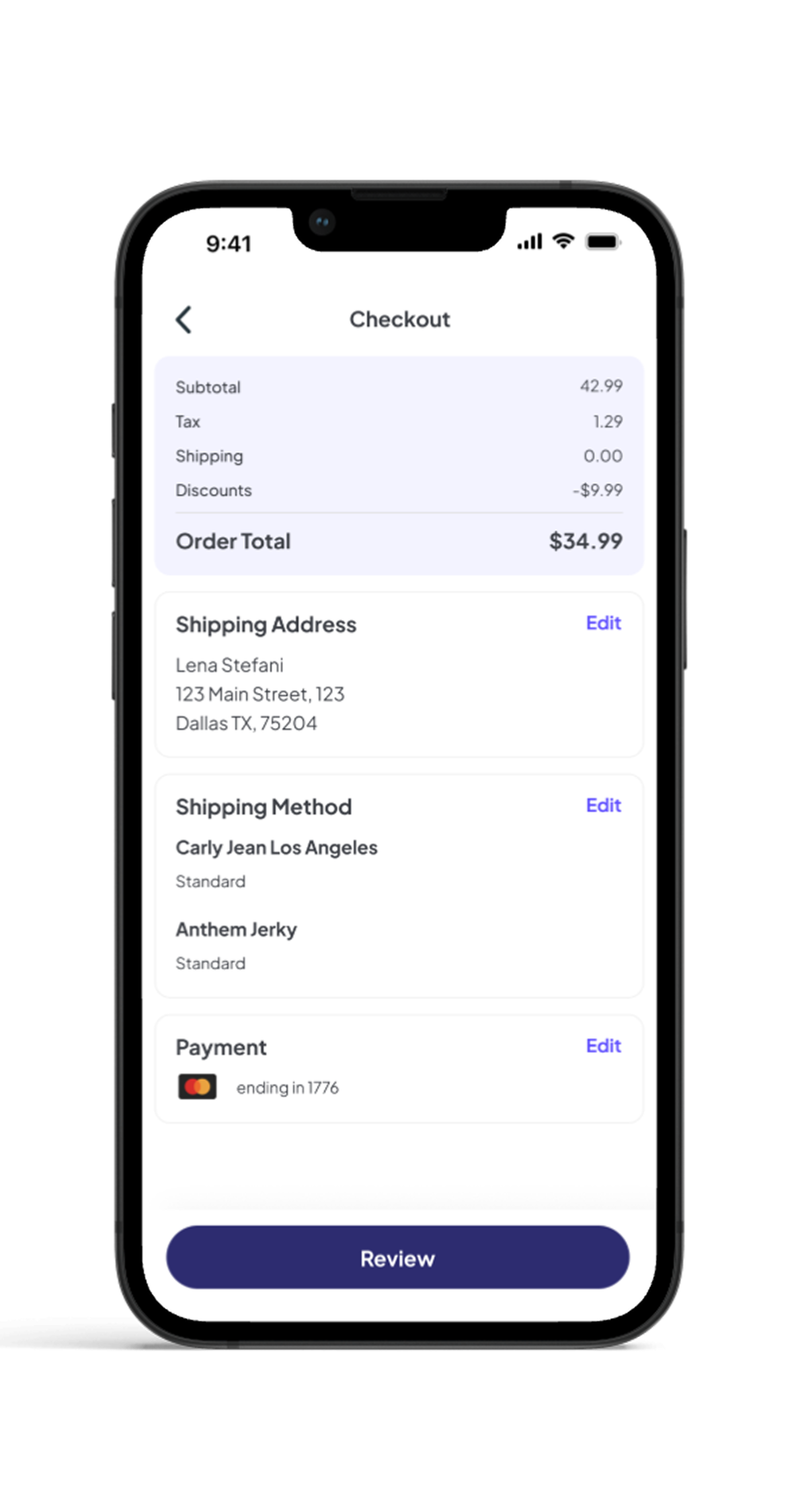
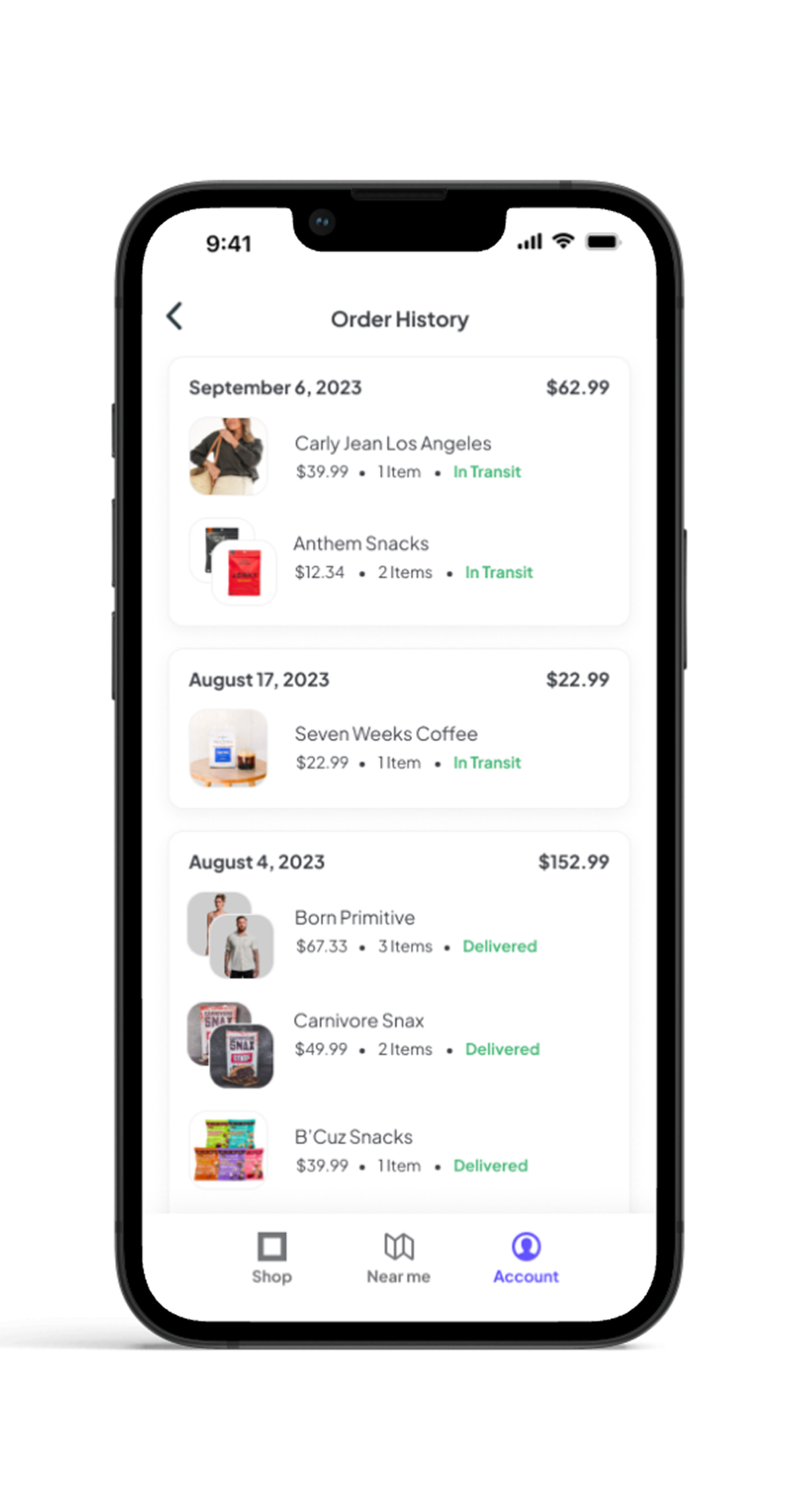
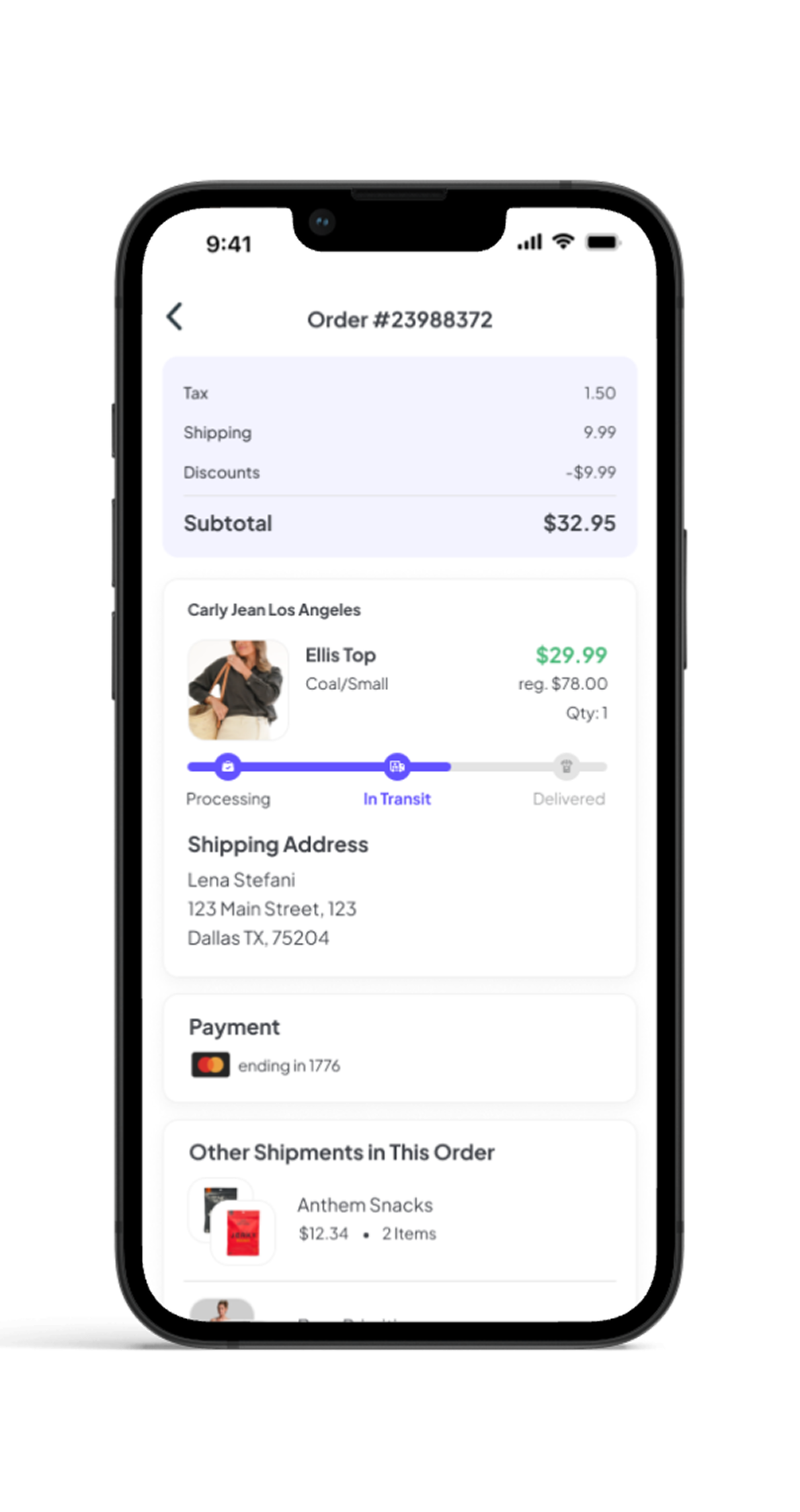
Want to see more?
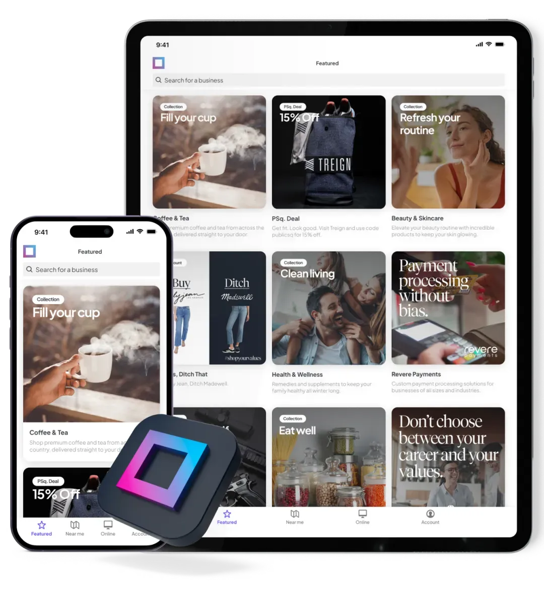
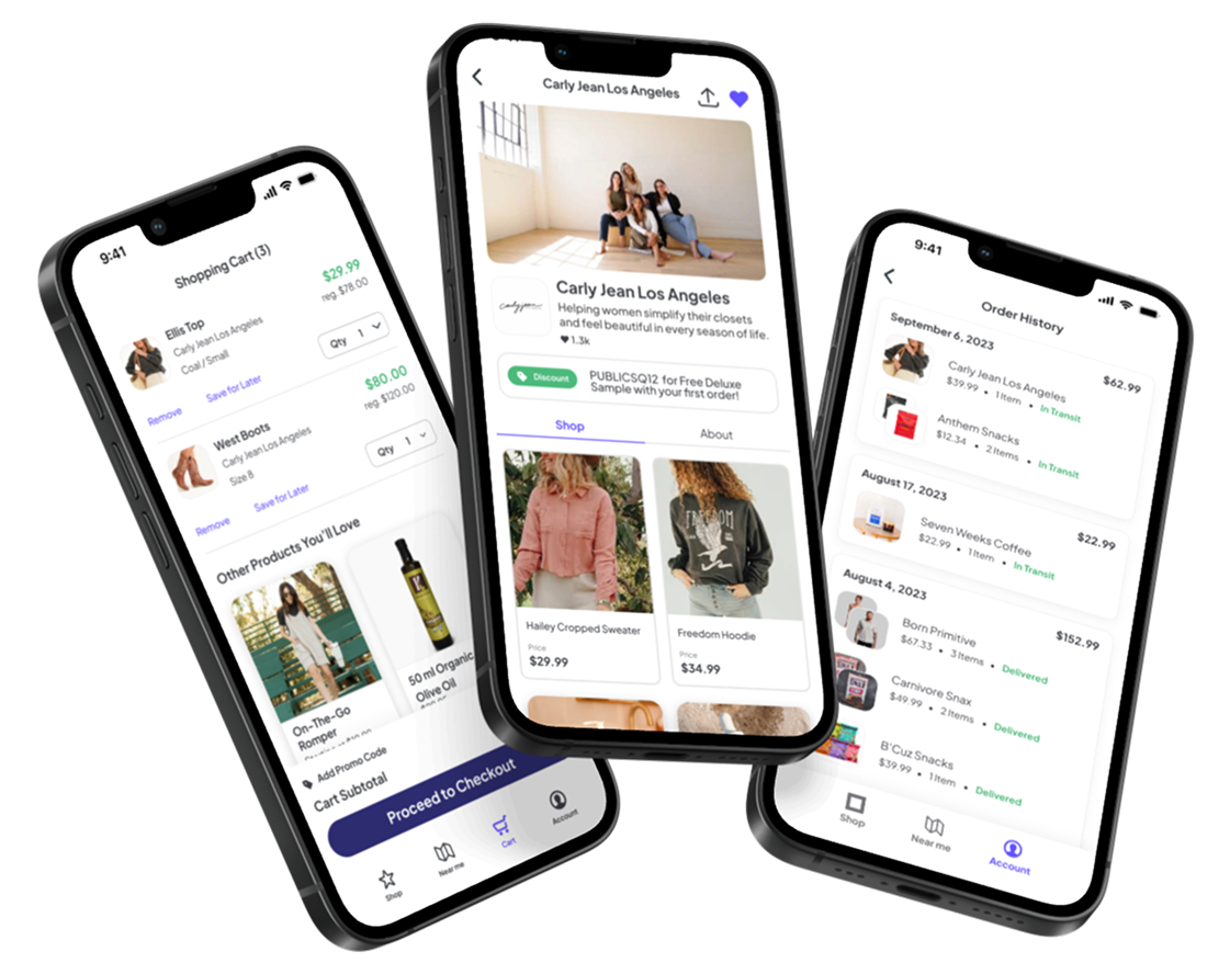
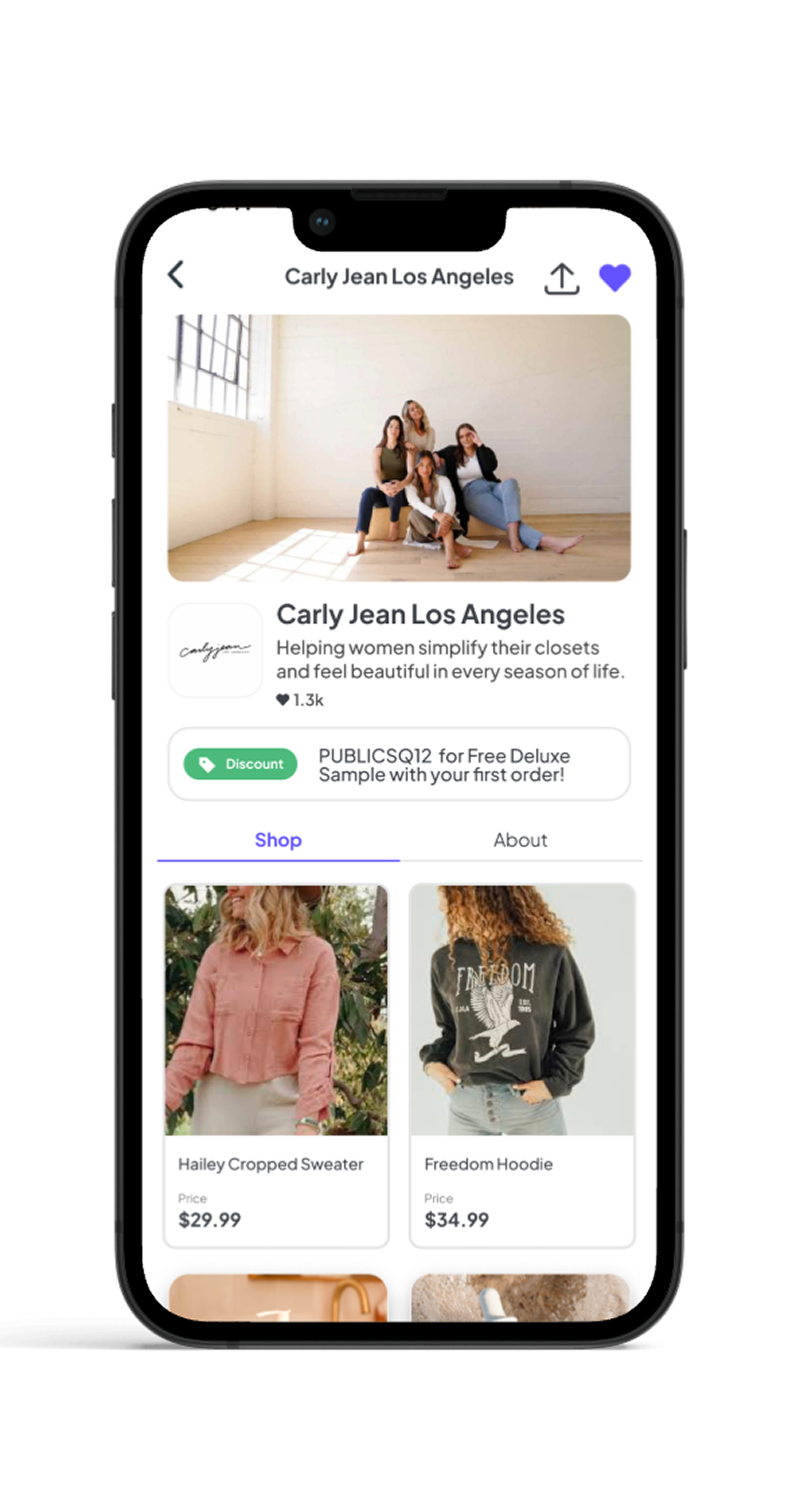
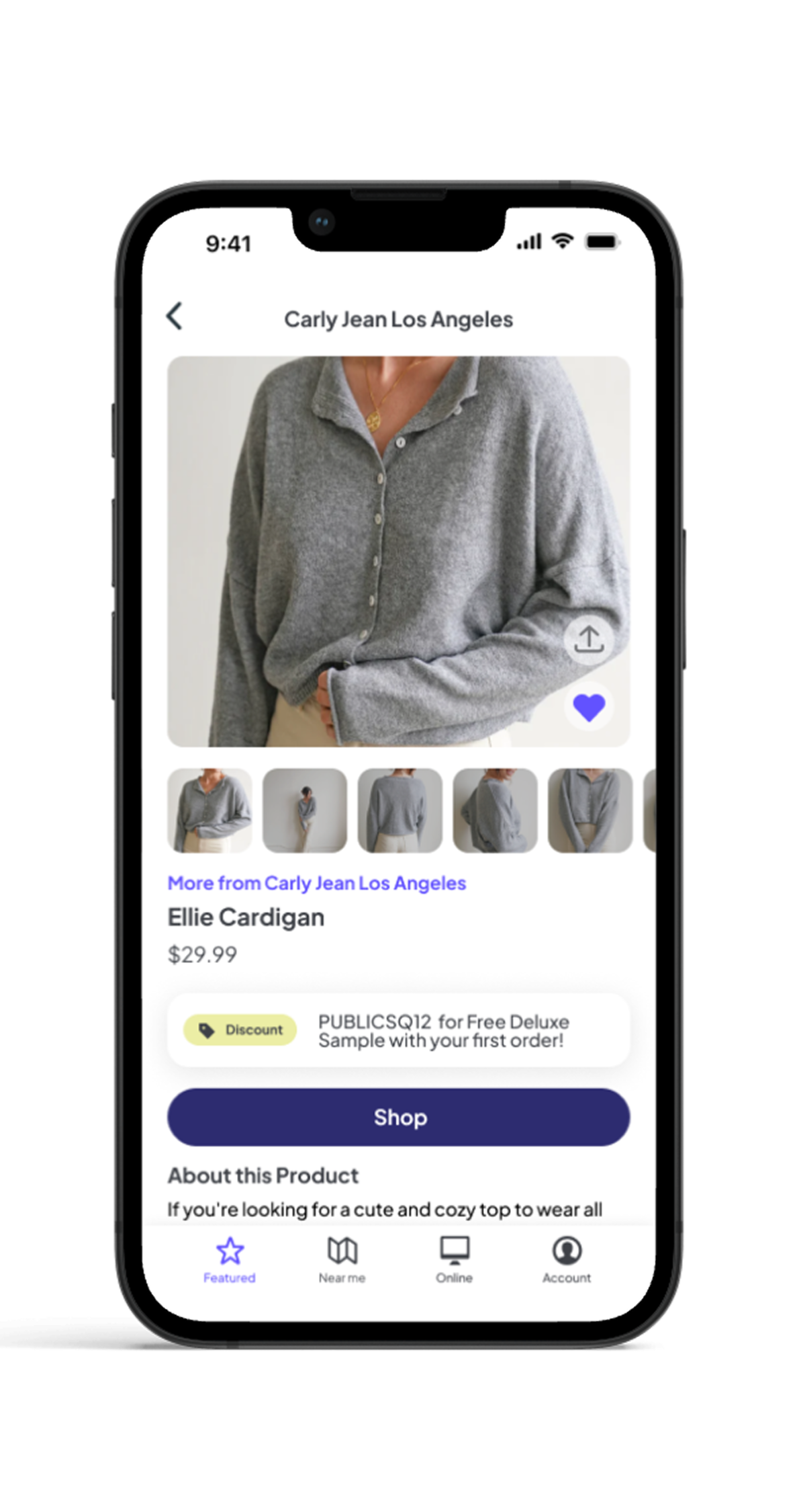
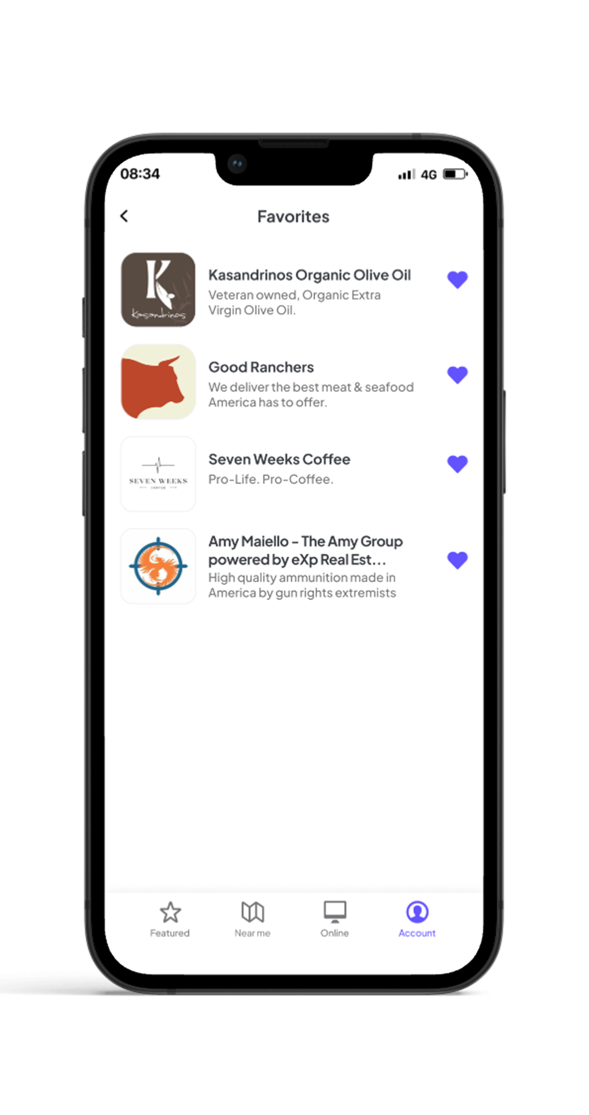
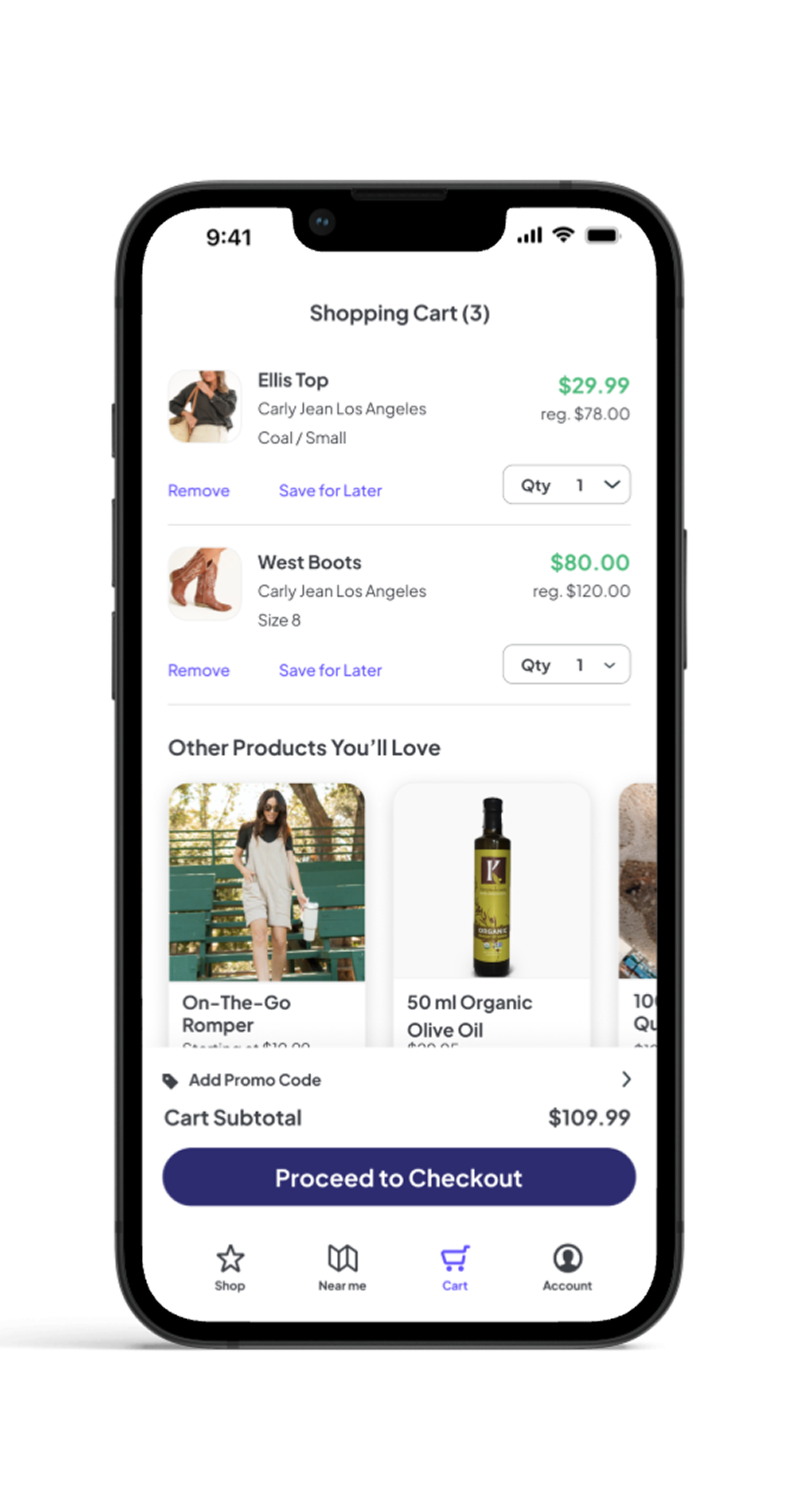
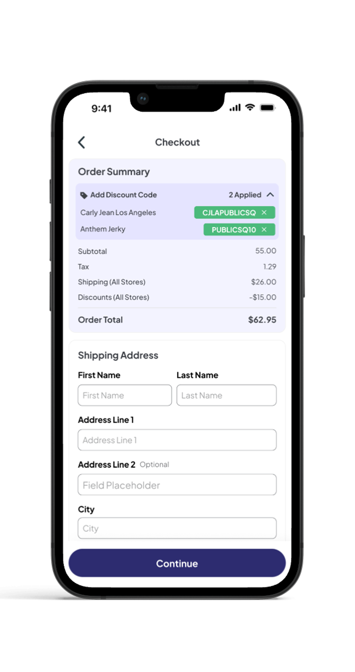
PublicSquare
Ecommerce · Mobile App
PublicSquare was a marketplace for American-made products, with a catalog of more than 160,000 items. As Lead Product Designer, I designed the mobile shopping experience end to end — from discovering small businesses to checkout and order tracking.
Want to see more?
Using ingredient-first packaging to win against category leaders


.png)


.png)
.png)
.png)
Great for advanced power users who want to get in and out of trades quickly.
Intimidating for new users and other types of traders to understand and locate.